In this rising rate environment, parking your money with an HYSA can earn you hundreds more per year. And yet, big banks that offer little APY hold 90% of all retail deposits. BankMatch helps people move their money to a professionally vetted, FDIC-insured HYSA that pays up to 200X more compared to traditional brick & mortar banks.
Problem statement
Consumers feel the financial benefits of switching to a high-yield savings account isn't worth the effort.
Challenges and considerations
Switching to a high-yield savings account is one of the easiest ways to grow your nest egg. So why do 9 in 10 Americans still keep their savings with big banks? At the beginning of this project, my team identified several challenges that we would need to address in order for this product to be successful. We did this during a "How Might We..." brainstorming session.
Among the notes:
-How might we convince users that switching banks is worth it?
-How might we fight the misconception that switching accounts is complex and laborious?
-How might we create a product that feels trustworthy?
-How might we create added value beyond simply matching a user with a bank?
-How might we fight the misconception that switching accounts is complex and laborious?
-How might we create a product that feels trustworthy?
-How might we create added value beyond simply matching a user with a bank?
Product value propositions
To overcome consumer trepidations about switching banks, we knew we would need more than just slick UI. I worked with our product and compliance teams to brainstorm and massage the following user value propositions.
Earn 100X more: We'd only work with financial institutions that could help consumers earn at least 100X more on their APY compared to big banks.
Cash bonus: We'd give users a $50 cash incentive for switching savings accounts through BankMatch.
Active account monitoring: We'd track the user's APY at their new bank and provide alerts if was no longer competitive by our standards.
Cash bonus: We'd give users a $50 cash incentive for switching savings accounts through BankMatch.
Active account monitoring: We'd track the user's APY at their new bank and provide alerts if was no longer competitive by our standards.
Voice and tone
To reflect the simplicity of switching to a HYSA, we resolved to use language that was clear, minimal, and approachable. Although our methodology is sophisticated, we wanted to avoid using complex language that would alienate users — even if it made our product look more impressive. We did want to provide off-ramps for people who wanted a product deep dive, but that granular-level detail would be deprioritized in the content hierarchy.
Accessibility
With 26% of the U.S. population identifying as disabled, it was imperative that we made accessibility a key consideration in the product build. From a content perspective, we strived to do that in the following ways:
-Provided alt text on all images, graphs, and other visuals.
-Wrote the vast majority of content at a 7th-grade reading level.
-Kept paragraphs short (40 words max) and sentences concise (80 characters max).
-Made tasks clear and provided microcopy to help users navigate.
-Wrote the vast majority of content at a 7th-grade reading level.
-Kept paragraphs short (40 words max) and sentences concise (80 characters max).
-Made tasks clear and provided microcopy to help users navigate.
MVP user flow
After establishing user value propositions, we took a stab at defining an initial user flow.
We then brought the user journey into higher fidelity using Figjam.
MVP landing page
From there, we went about creating an MVP landing page. We wouldn't send much traffic to this page; it would mainly be used to gauge user sentiment of the product. If we felt convicted that users were truly interested, we would make the investment to build it into something better.
MVP question flow
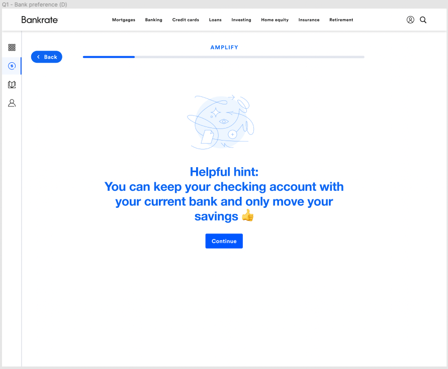
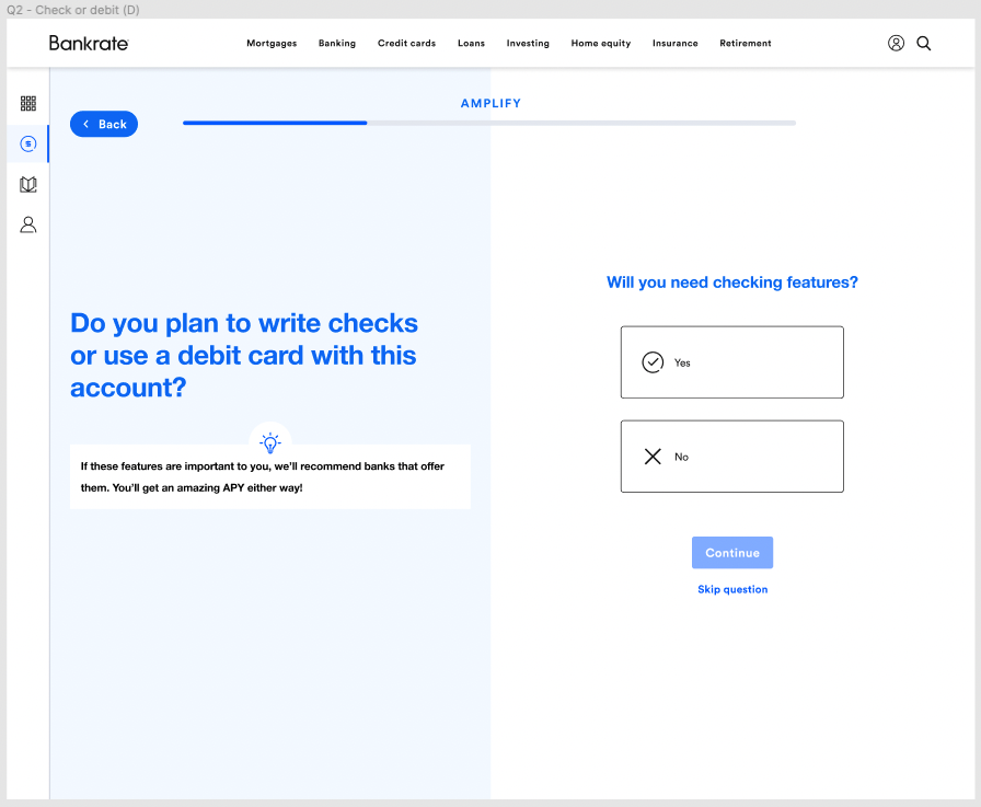
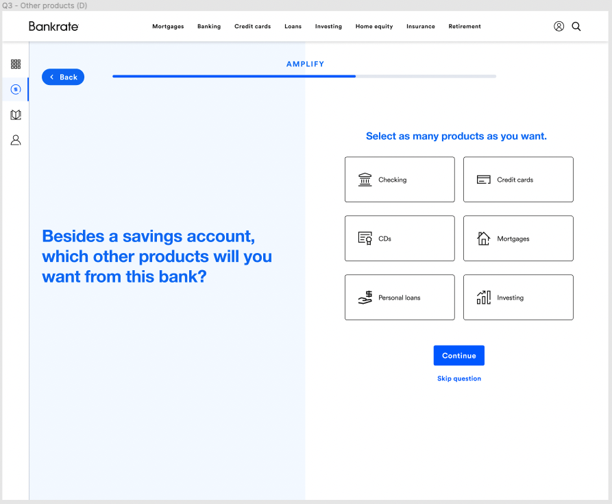
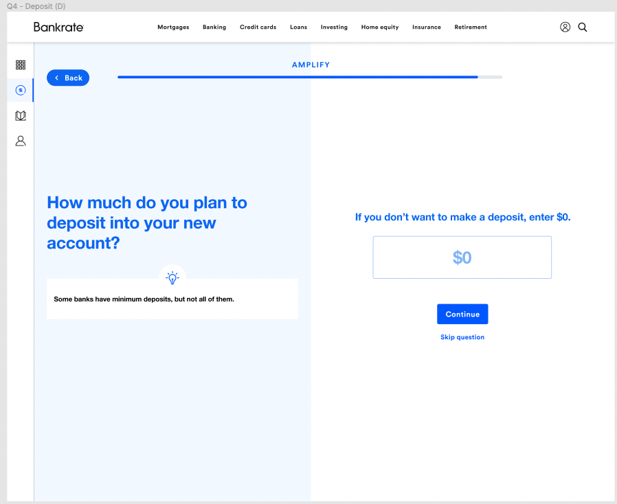
The original question flow spliced questions with value props that proactively addressed known consumer tensions. Since the flow would only be shared during user testing, the execution was very lo-fi.



MVP results page
The results page showed one top match, followed by other options for users to consider.
Testing user sentiment
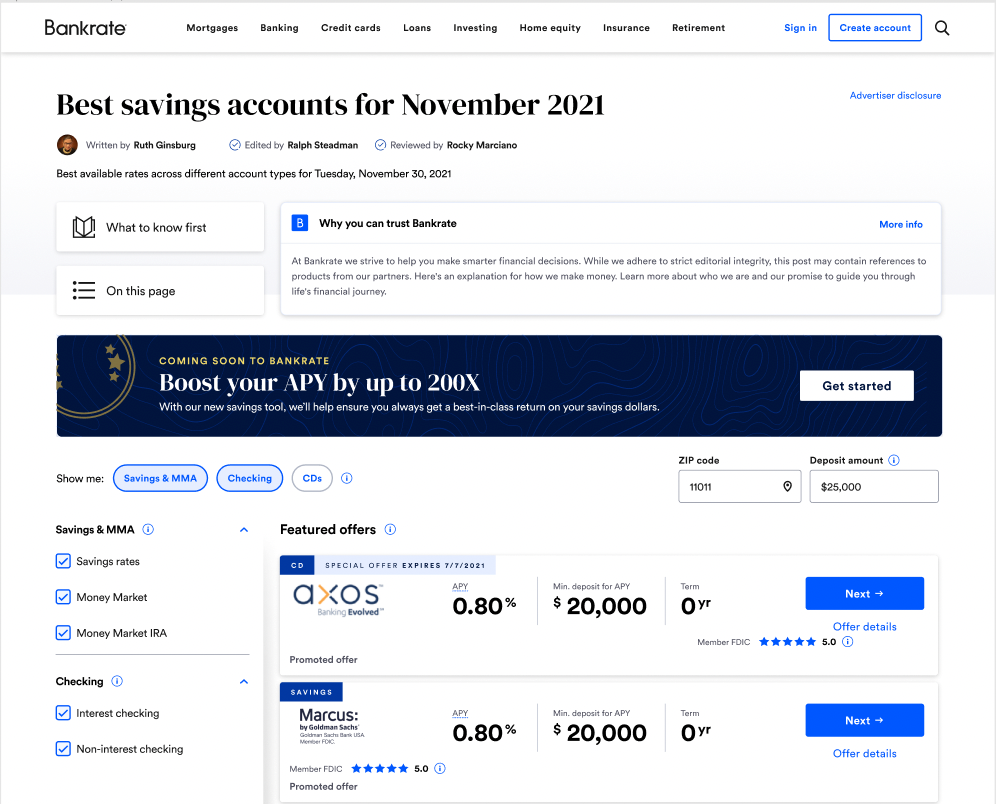
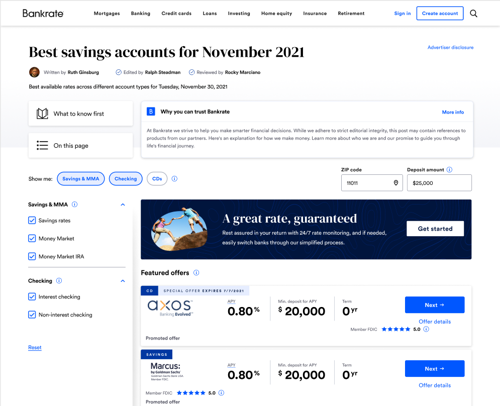
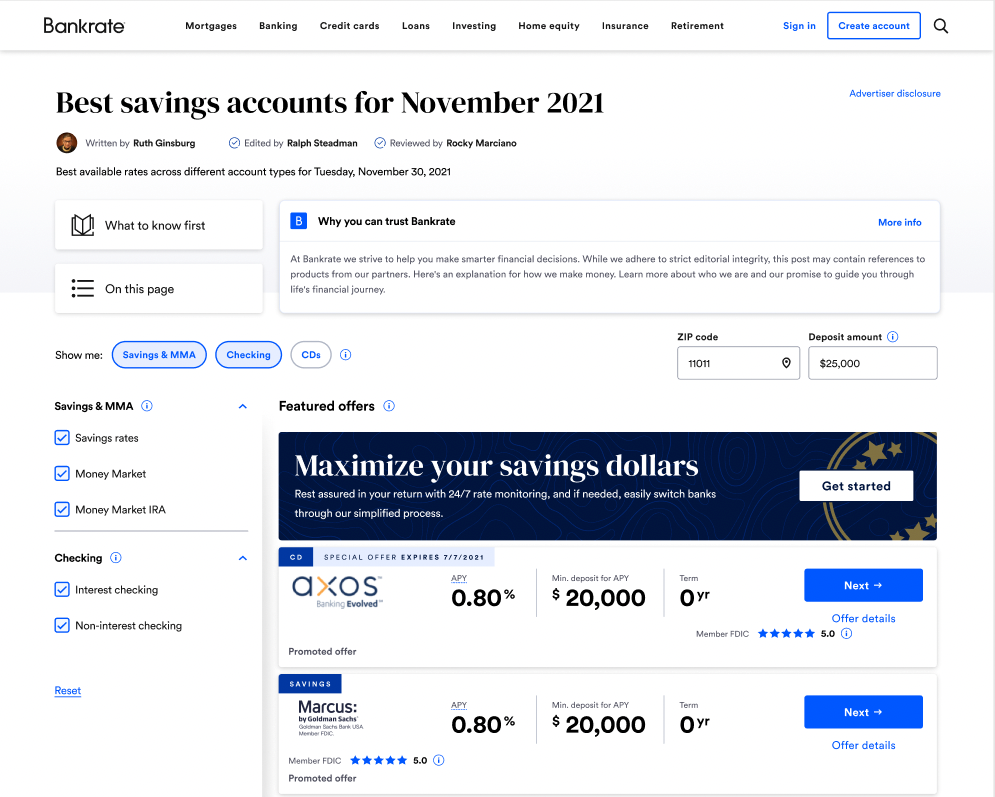
To gauge user interest, we ran a "smokescreen" test on our savings rate table page. A banner above the rates would promote the ability to get a great rate by switching accounts. Click volume would be a strong KPI of whether users would be inclined to use this product. By testing three banners, we would also see which messaging was most resonant.
User research
After click volume suggested user interest in BankMatch would be high, we ran a usability test of our MVP landing page and onboarding flow. During the test, we conducted 60-minute moderated interviews with 6 users, each of whom was looking for a new savings or checking account.
Research goals:
1) Understand if the product is navigable and comprehensible.
2) See if users would feel that their results were personalized.
3) Gauge click-through intent on the results page.
4) Get general feedback on the design layout and flow.
1) Understand if the product is navigable and comprehensible.
2) See if users would feel that their results were personalized.
3) Gauge click-through intent on the results page.
4) Get general feedback on the design layout and flow.
Results
1) Users felt this product would be very helpful, scoring a 4.2 out of 5.
2) While users saw value in the product, they felt the onboarding process was too long.
3) Users trusted our product recommendation but wanted to do their own research.
4) We should show 2-3 strong matches, versus only one.
1) Users felt this product would be very helpful, scoring a 4.2 out of 5.
2) While users saw value in the product, they felt the onboarding process was too long.
3) Users trusted our product recommendation but wanted to do their own research.
4) We should show 2-3 strong matches, versus only one.
Designing the next iteration
Armed with strong user insight, we pivoted to the next iteration of BankMatch. We started with another co-creation where we all partook in sketching low-fidelity mockups.


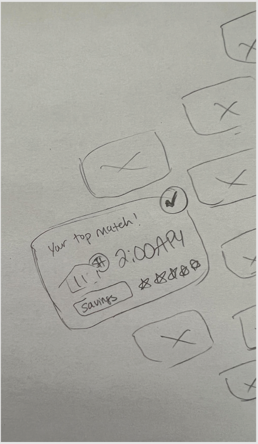
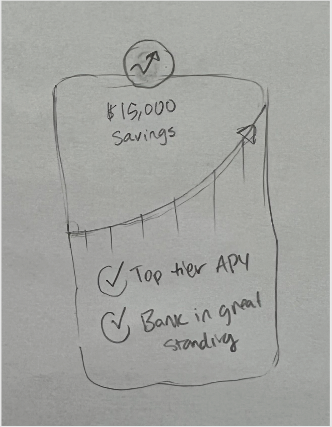
From there, we continued to iterate until we fleshed out our 2.0 iteration of the landing page, user flow, and results page.
Landing page 2.0
The landing page uses minimal copy and strong design language to play up the value of this product. The content works hard to assuage concerns that users cited during testing, most notably around the complexity of switching banks and the fear of hidden fees.
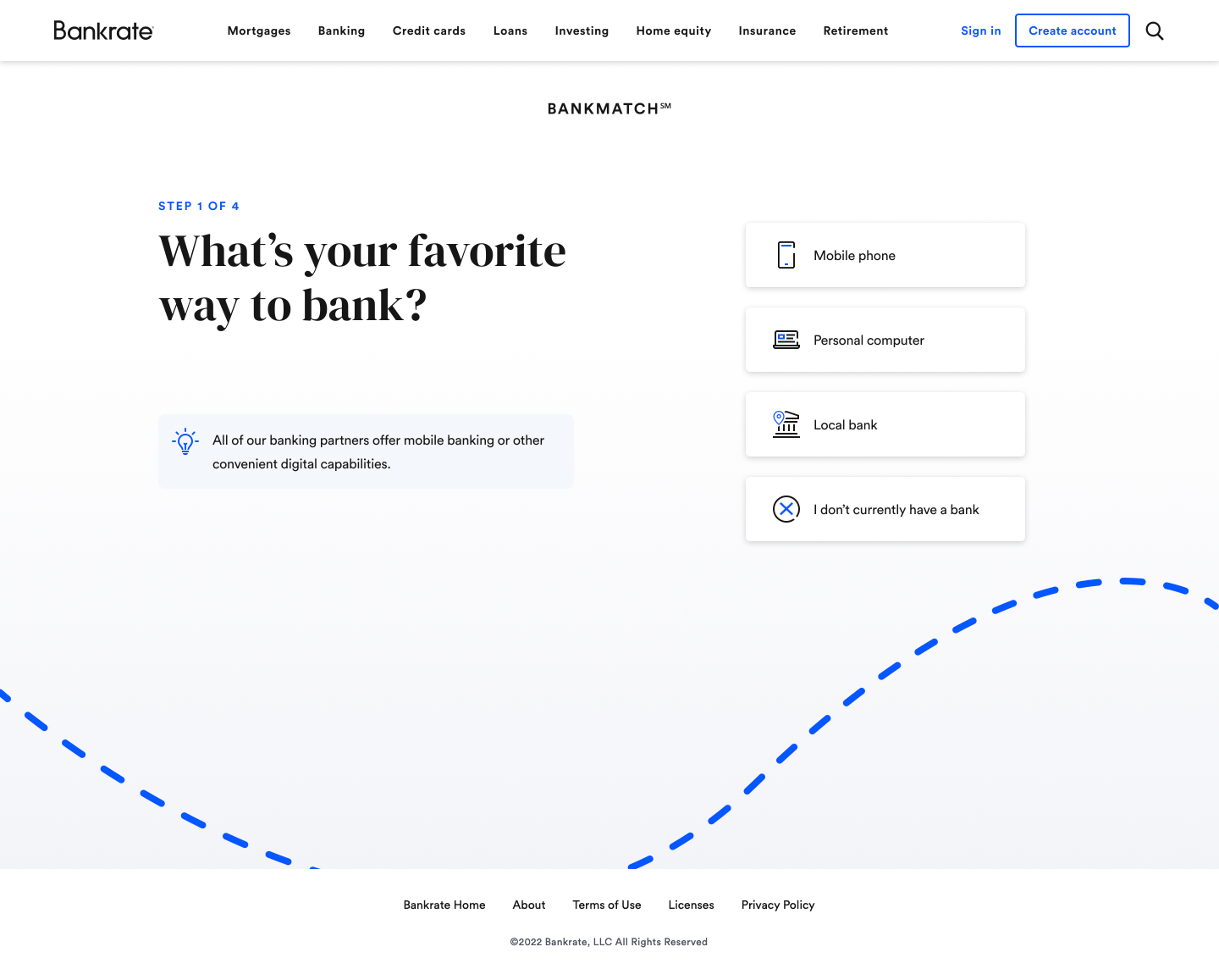
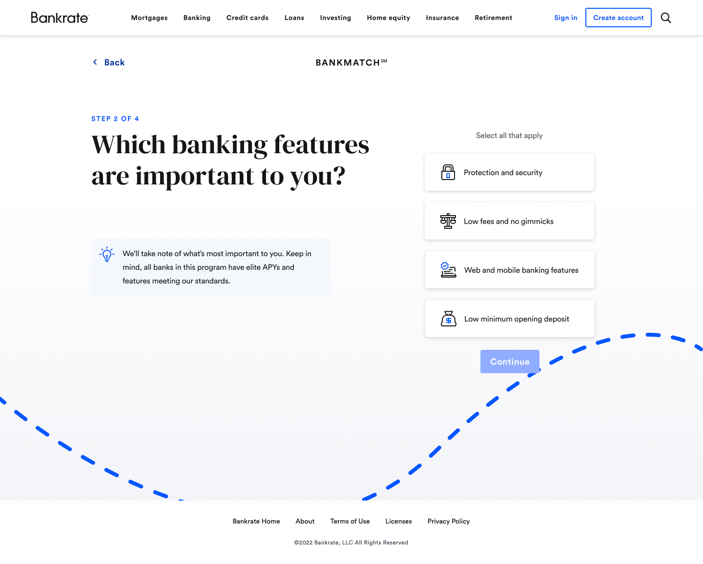
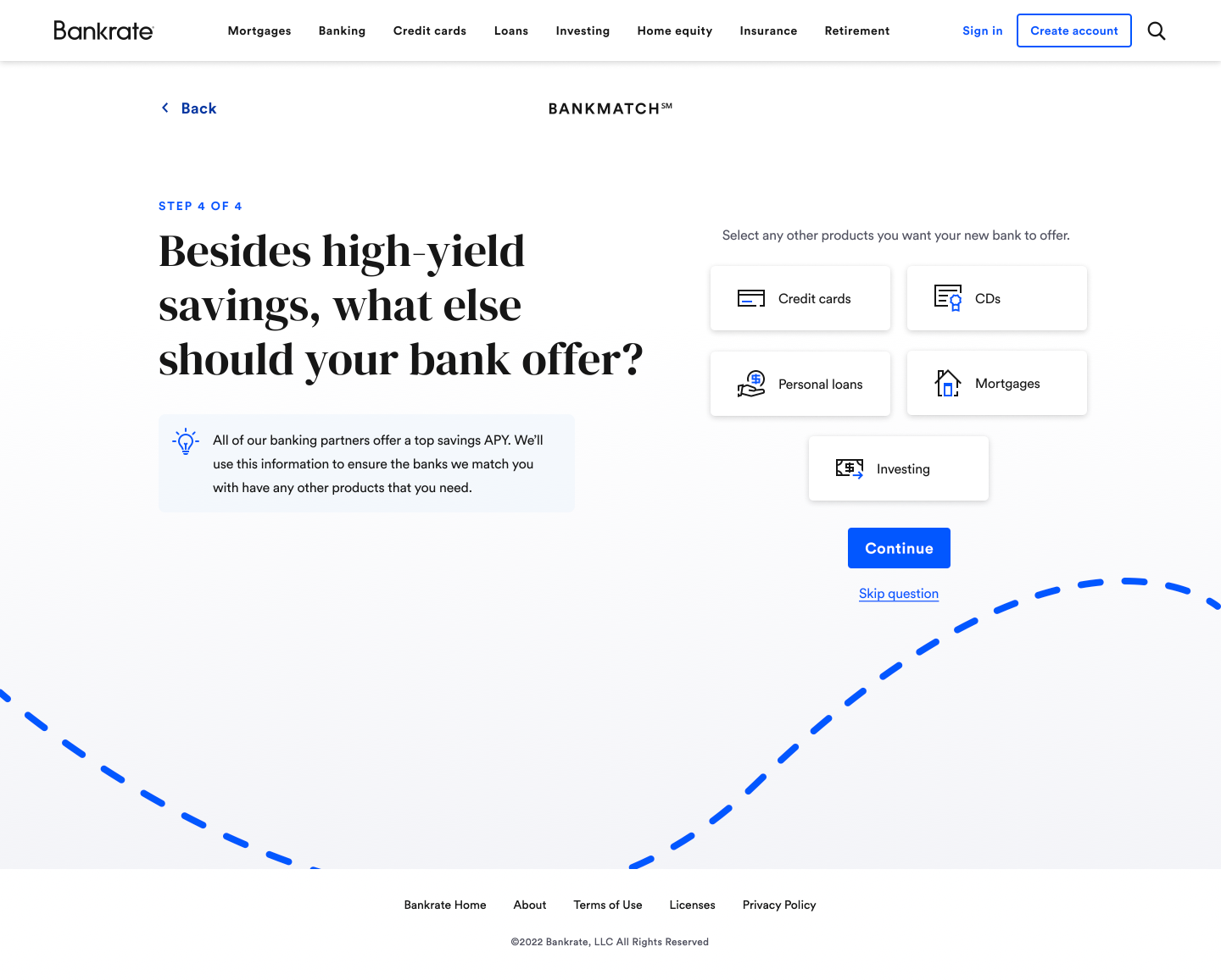
Question flow 2.0
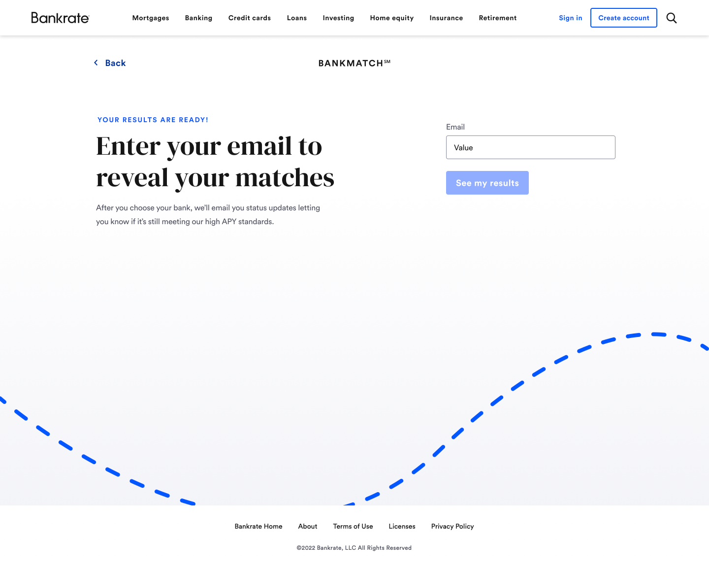
We created a trimmed-down question flow that reaffirmed value propositions on the screen. With only four total questions and no barrier to entry beyond a simple email input field, we anticipate a very strong conversion rate.

Results page 2.0
The results page shows the user's top three matches, as opposed to only one. Since there are only 12 total banks in the program (as of now), we decided to expose the other nine banks as well further down the page.
Methodology page
To give users insight into how we vet our banks, we created a BankMatch methodology page that we link to from the landing page, the results page, and emails.
Content KPIs
While it's difficult to isolate the content from the rest of the product, we established tangible benchmarks that would help us gauge the quality of our output. These included:
-2% click-through rate on entry banners on the rate table.
-80% completion rate on question flow.
-7.5% conversion rate on the results page.
-4.5/5 "this product is clear" rating during.
-4.5/5 "this product is exciting" rating.
-80% completion rate on question flow.
-7.5% conversion rate on the results page.
-4.5/5 "this product is clear" rating during.
-4.5/5 "this product is exciting" rating.
Results
Since BankMatch 2.0 will not launch until Q4 of 2022, I don't have any results to share quite yet. But considering the rate environment and the amount of excitement conveyed during user testing, we're expecting great results. And of course, we will continue to iterate throughout the life of this product.
Roles:
Content Design
Content Direction
UX Strategy
Content Design
Content Direction
UX Strategy
Credits:
Creative Director: Tim Meissner
Product Design: Ryan Freeze
Creative Director: Tim Meissner
Product Design: Ryan Freeze