Buying a home is hard. Like, really, really hard. The Bankrate Homebuying Journey streamlines and demystifies the process by guiding users through every step and allowing them to complete essential tasks in a single, trusted interface.
Challenges and Considerations
Turns out, the only thing harder than buying a home is creating a digital experience about the process. Pulling this UI/UX together was a 12-month process that required intense collaboration with stakeholders across various teams, including creative, product, UXR, and editorial.
From a content strategy perspective, the biggest challenge was building a journey for a process that's not only complicated and protracted but also non-linear.
The thing is, there's no "right" way to buy a home.
Some hire Realtors; others avoid them (and their hefty fees).
Some get pre-approved, others skip the step altogether.
Some get a mortgage; others pay with cash.
To accommodate different preferences and circumstances, we needed to create a framework that was scalable and flexible.
To put it metaphorically, we focused on building bookshelf, not the books.
Discovery and Flow Mapping
From a content perspective, one of the biggest challenges was defining the various steps of the homebuying process and putting them in a logical order. This was my approach:
After getting buy-in on the steps, I worked to group them in a way that would feel digestible. I did this by listing out each of the steps and bucketing them into different categories. Each category represents a different milestone of the homebuying process, such as "shopping for a home."
While going through that process, I also worked with our product design lead to support early UI explorations.
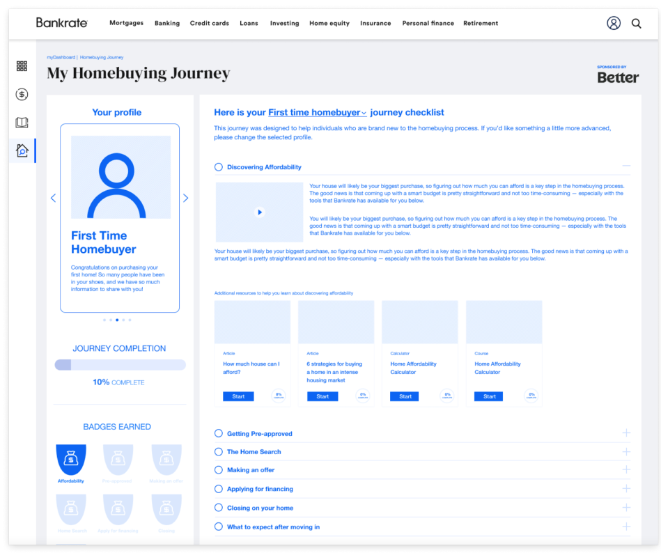
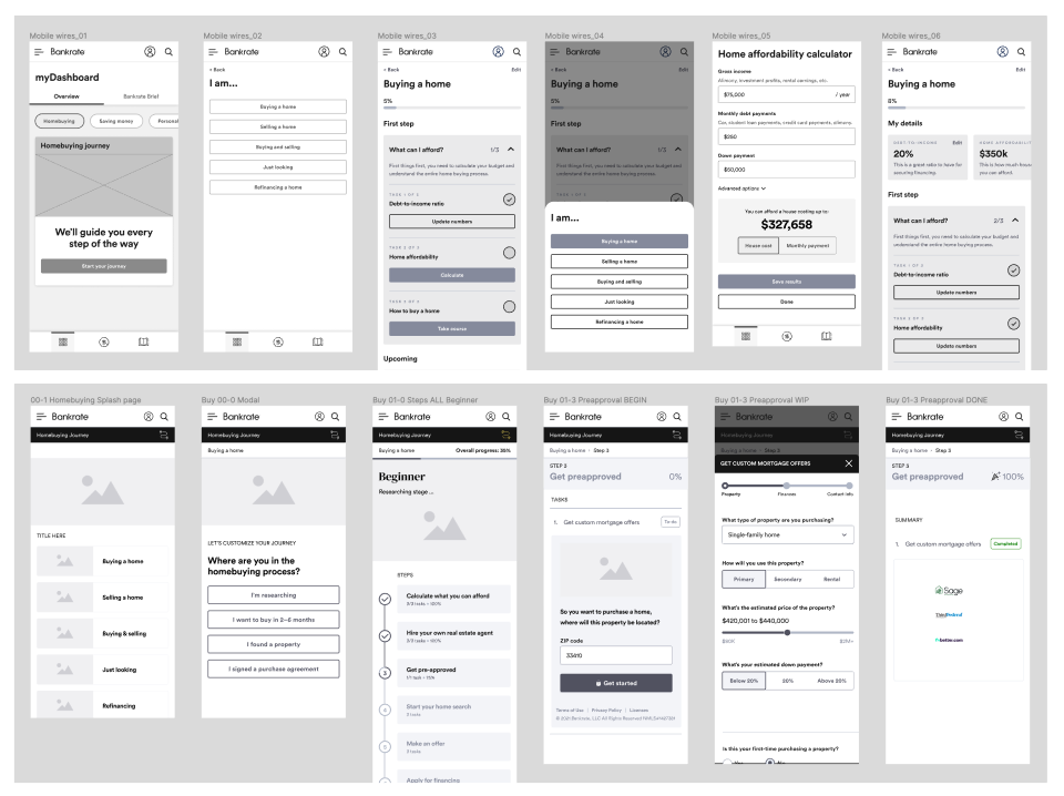
Homebuying Journey MVP
After months of designing and testing, we landed on an MVP version of the journey. When logging into their Bankrate account, users see a promotional tile in their dashboard. We created separate versions for new and returning users.

Inactive State

Active State
After clicking the CTA, new users are taken to a quick onboarding screen. The content flows continuously from screen to screen, striking a conversational tone. This was a pattern that I validated during user testing.
After onboarding, users are dropped into the journey home screen and instructed to choose the step that matches where they are in the homebuying process. By allowing users to self-select, we're able to meet them where they are.
We wanted to provide more than just a roadmap through the homebuying process. We also wanted to offer education, guidance, and actionable next steps. We did this by creating three distinctive types of content, all embedded within the journey UI.
1. Snackable videos
2. Listicles
3. Brand and partner integrations
2. Listicles
3. Brand and partner integrations
We also created guided question flows to help users get personalized insights, like how much home they can afford.

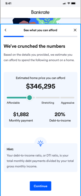

We allow users to skip steps and come back to it later, if they choose.
When a task is completed, we mark it so and provide contextual details in the sub-copy.
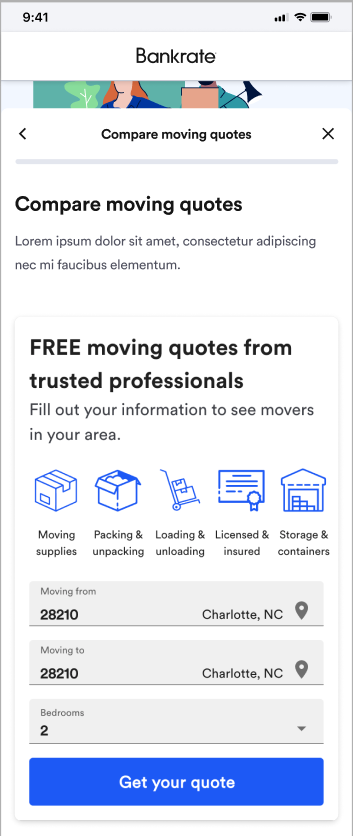
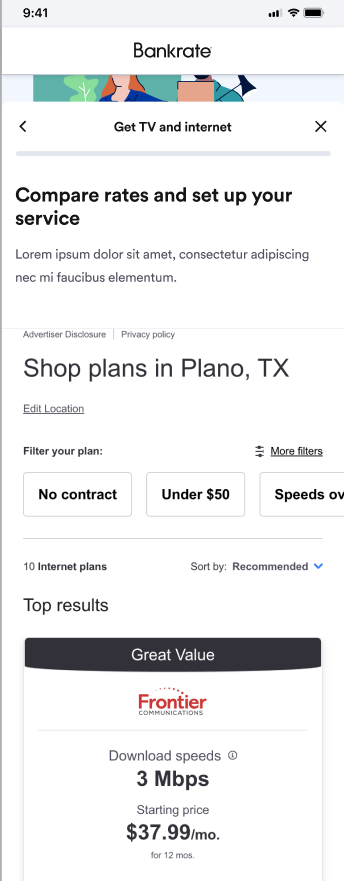
Beyond education, we also wanted to provide tangible steps users can take to advance through different stages of the process, such as getting a mortgage or booking a moving company. We were able to do this by wrapping in widgets from Bankrate and other partner brands, such as MyMove and AllConnect.


Summary
We launched the MVP version of this tool in May 2022. We will monitor engagement and iterate as needed. As a long-term vision, we hope to bring in more integrations, with the ultimate goal being to allow users to complete literally every step of the homebuying process in a single digital environment.
Roles:
Content Design
Content Strategy
Content Writing
UX Strategy
Content Design
Content Strategy
Content Writing
UX Strategy
Credits:
Director of Product Design: Ricky Carlton
Senior Product Designer: Maks Sokolov
Associate Product Designer: Olivia Odell
Director of Product Design: Ricky Carlton
Senior Product Designer: Maks Sokolov
Associate Product Designer: Olivia Odell