Bankrate is a brand in transition. From our roots as a single-track marketplace for comparing rates, the brand has evolved into a multi-faceted personal finance platform dedicated to guiding users through their unique financial journey.
To deliver on our brand promise of personalized financial guidance, we created our free Bankrate account. Users who create an account receive a bounty of premium benefits, including access to Masterclass-style financial courses, custom banking offers, and personal finance management tools.
Less than two years from launch, we've netted over 2.5 million users. In addition to strong down-funnel performance, this investment has enabled us to foster long-term relationships with users, lower acquisition costs, and lessen our reliance on Google and paid media.
Since Day 1, I've led content strategy and design for this thriving product.
Creating an Account
With account creation serving as a key pillar of Bankrate's growth strategy, we positioned multiple CTAs above the fold on our brand homepage.
Users who click through on a CTA are driven to our Create Account landing page, which highlights the value propositions of activating their free account.
The landing page is dynamic, featuring different UI triggers depending on the user's entry point. For example, if the user clicks through from an ad promoting an educational course, the secondary content well (just below the masthead) defaults to our learning tab.
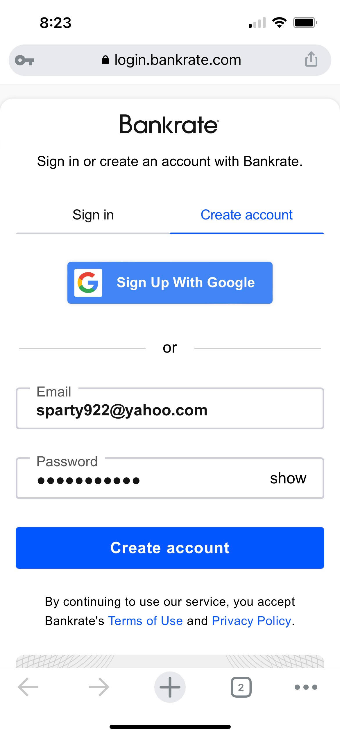
From the landing page, users who wish to create an account are taken to an Auth0 widget to provide an email and password.
Onboarding
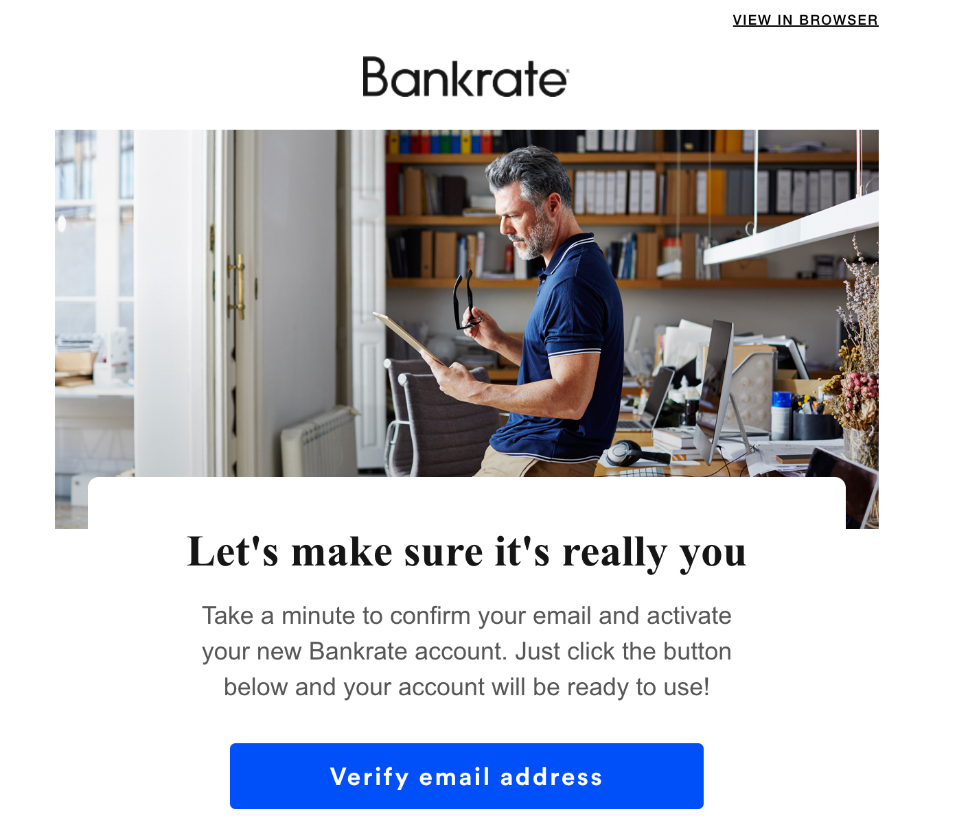
After verifying their information, users are taken to our onboarding experience. Here, we welcome users to their new account and reaffirm the features they can now access.
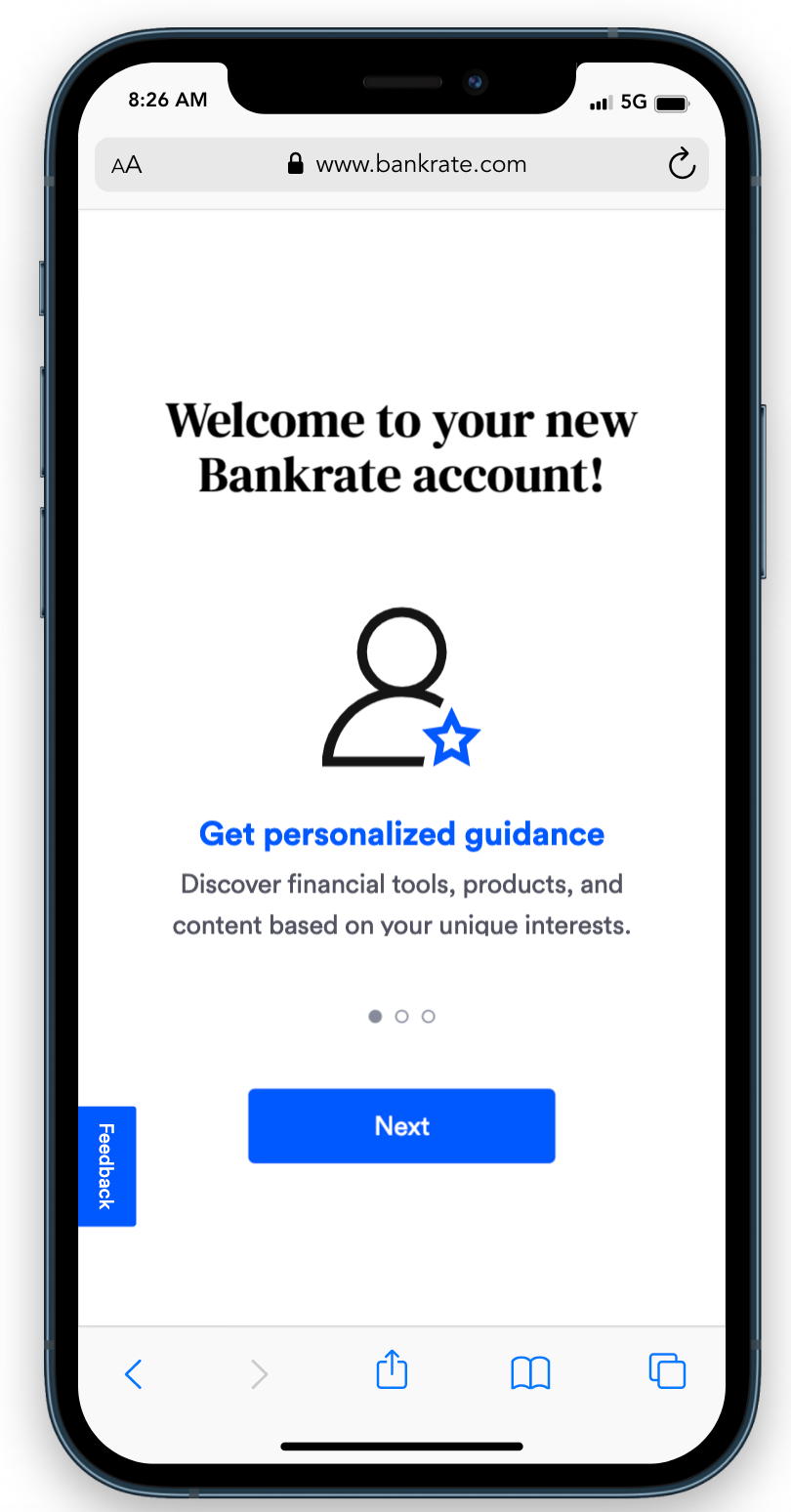
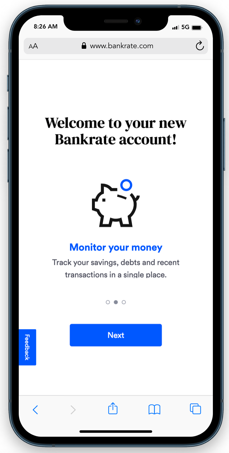
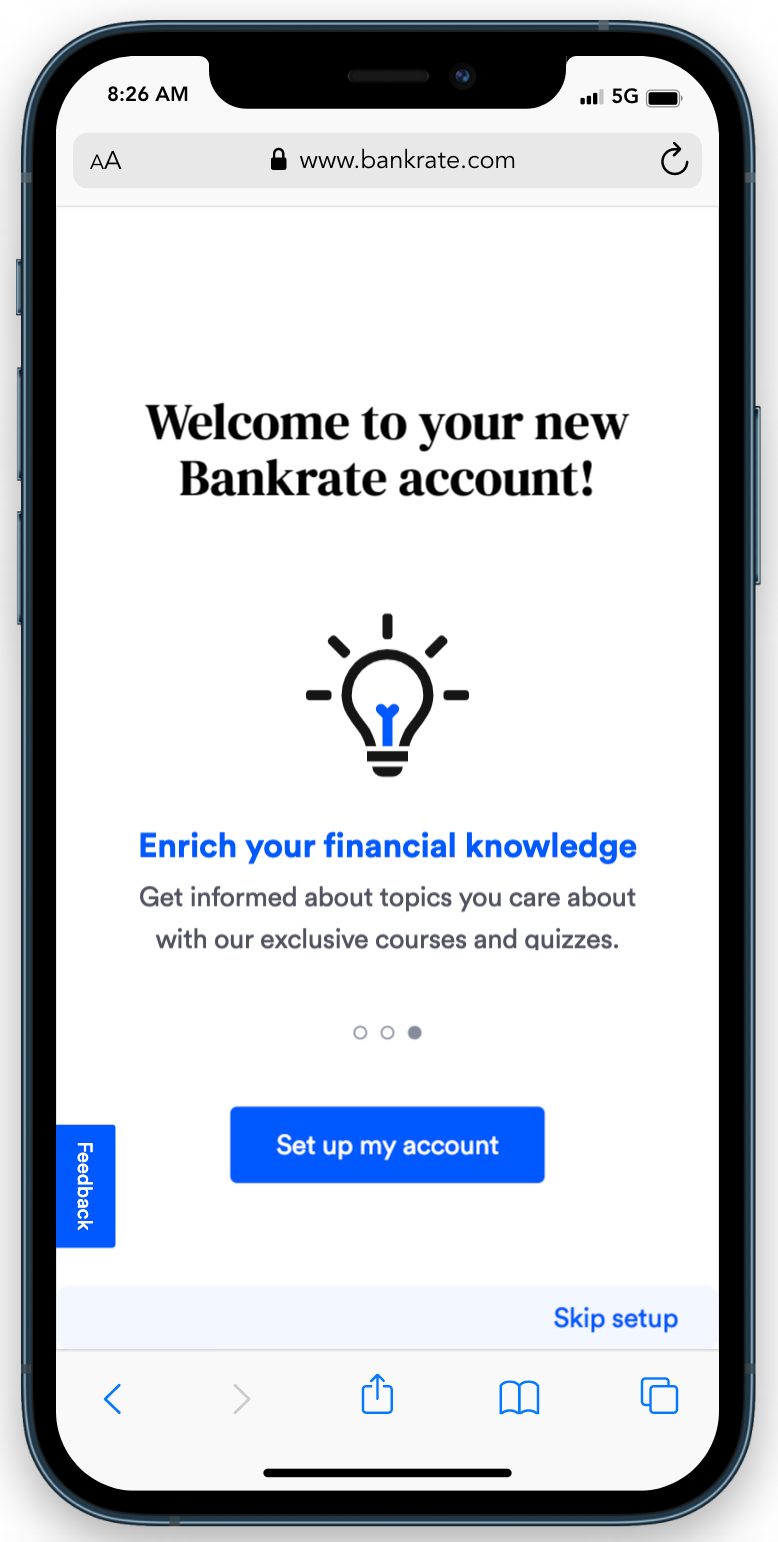
After these quick reminders, we drive users to finish setting up their accounts so they can personalize the type of information that they see.
The first step for users is to select their interests, which enables us to personalize their dashboard with relevant content.
Next, we prompt users to take other actions to make the most of their account, from linking their financial institutions to taking a learning course and more.
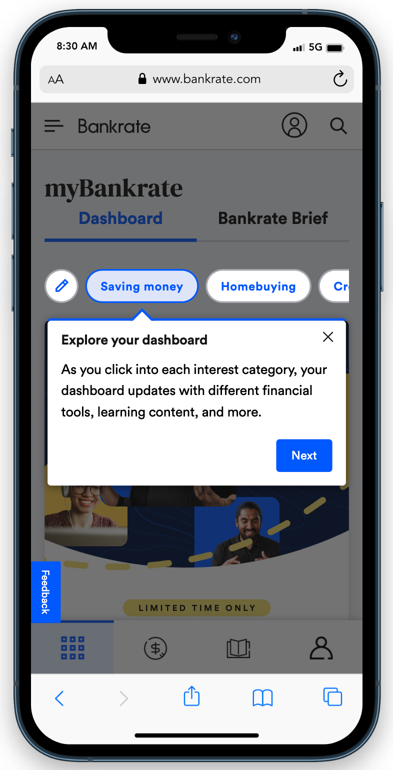
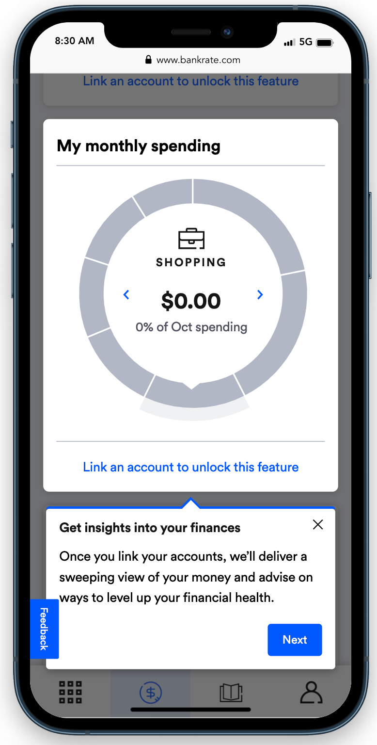
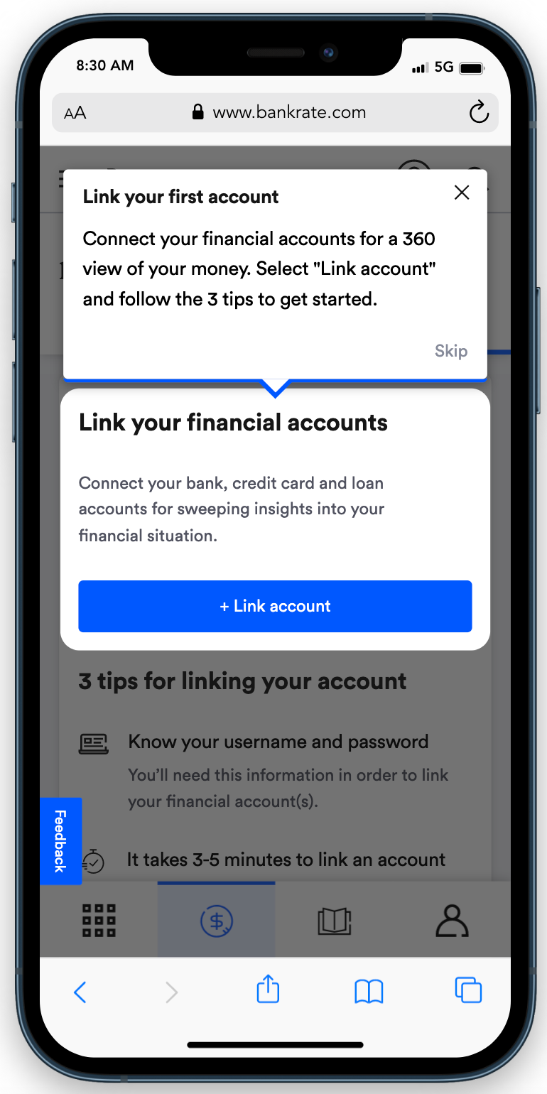
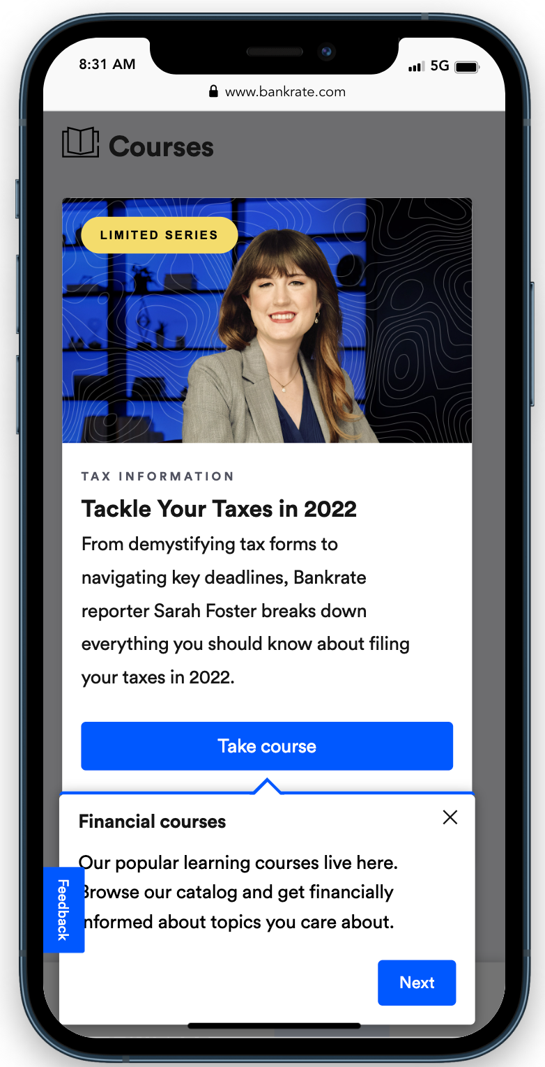
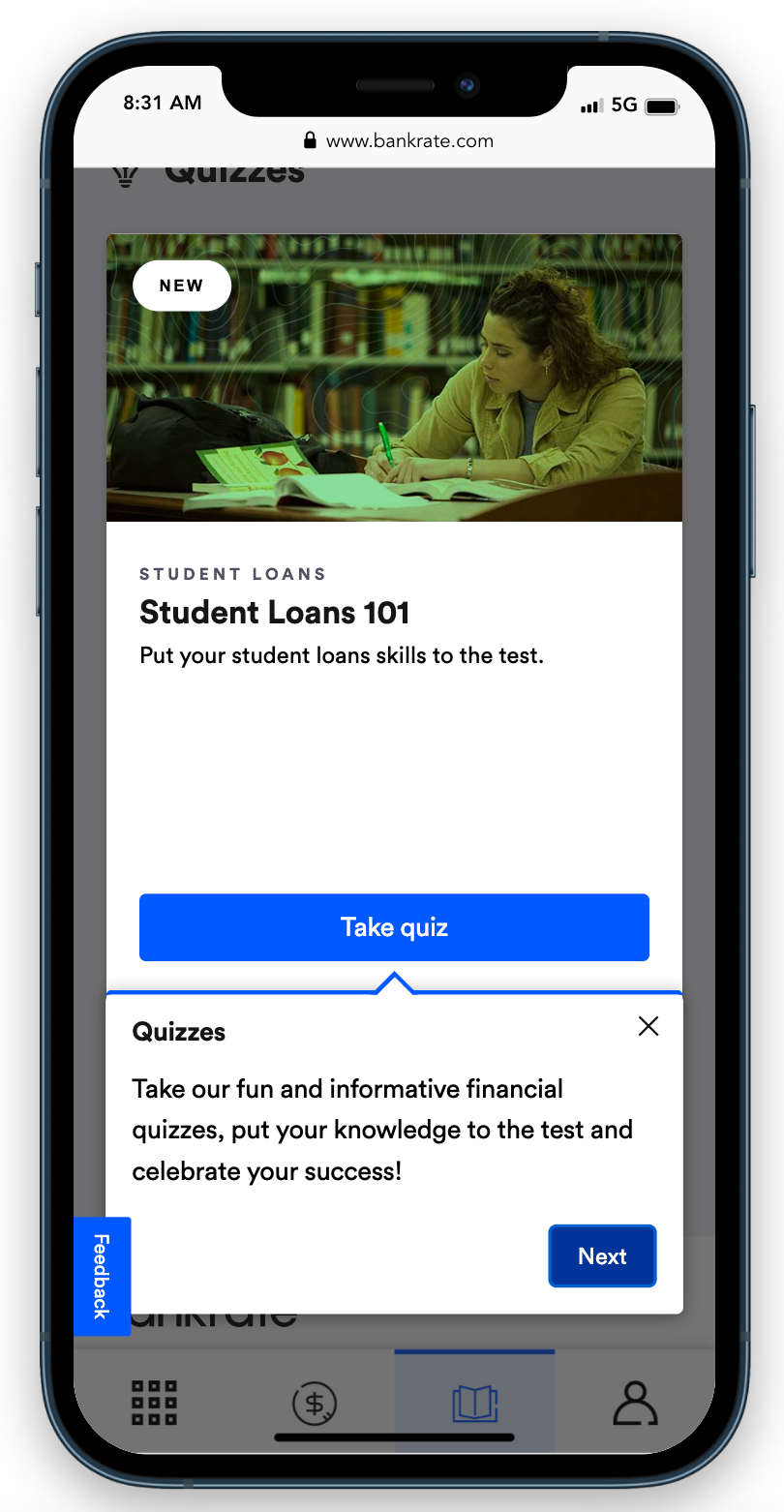
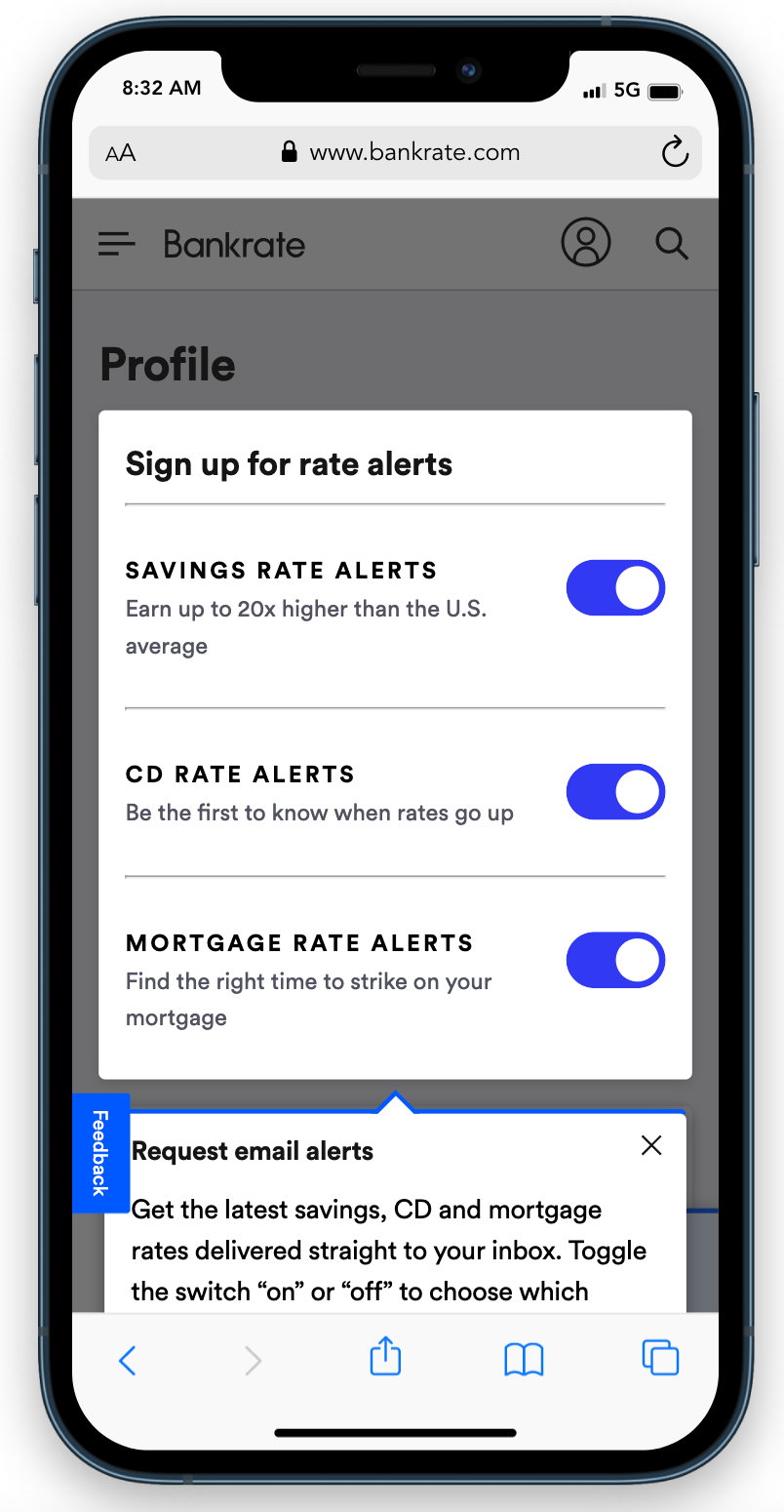
When the user completes the onboarding flow, we acknowledge it and then move the user to their customized dashboard.
The Product
myDashboard
The landing page of the experience is a dashboard that curates relevant tools and content based on the user's selected interests. Using the icons in the nav footer, users can seamlessly switch from the dashboard to other sections of the account.
myLearning
Financial illiteracy cost Americans $350B in 2021. Our myLearning platform aims to address this problem by giving people free access to reliable and trustworthy financial information.
Our flagship product is our suite of Intro to Finance courses. These are full-length videos that guide users through pivotal processes, such as budgeting, investing, homebuying, and more. The courses — which I strategized, scripted, and co-produced — are delivered in plain language to demystify complex processes and concepts.
Users who take a course are 30% more likely to engage with Bankrate and have significantly higher Average Revenue Per User (ARPU), since they're more likely to transact with our marketplace tools.
Users who take a course are 30% more likely to engage with Bankrate and have significantly higher Average Revenue Per User (ARPU), since they're more likely to transact with our marketplace tools.
In addition to long-form video courses, we also provide education through a weekly quiz. Quizzes have proven to be an excellent source of re-engagement.
myMoney
Beyond empowering people with financial education, we wanted to give users the ability to monitor their own financial health. myMoney is a suite of personal finance management (PFM) tools that enable users to track their spending, debt, and transactions.
Performance
In less than 2 years, we've achieved more than 2.5 million account creations, the vast majority converting through organic traffic. Our known users have stronger retention than our anonymous users and are more likely to connect with lenders on our marketplaces. Better yet, we're only getting started!
Credits
Director of Product Design: Ricky Carlton
Product Designer: Maks Sokolov
Associate Product Designer: Olivia Odell
Director of Product Design: Ricky Carlton
Product Designer: Maks Sokolov
Associate Product Designer: Olivia Odell