Businesses come to eBay to access the company's large buyer base. Unfortunately, many are stopped in their tracks by a daunting registration process. In my first project at the company, I co-designed the revamped B2C seller registration flow to make becoming an eBay seller more attainable for businesses all over the world.
Background and problems statement
Our legacy B2C registration flow was lengthy, complex, and not tailored to business needs. What's more, it didn't set proper expectations around the requirements for completing registration. All these factors led to a 29% drop-off rate and other concerning metrics.
Problems to solve
-High drop-off rate throughout the flow
-Sellers creating wrong account types
-Sellers registering as wrong business entity
-Unclear expectations about what registration entails
-Too much perceived time to get set up and list items
-Sellers creating wrong account types
-Sellers registering as wrong business entity
-Unclear expectations about what registration entails
-Too much perceived time to get set up and list items
Proof points
-47% of B2C sellers don't list within the 1st month
-9% of new businesses make a sale within their first 28 days (see chart)
-5% of new businesses sell on eBay for 2 consecutive months after signing up
-9% of new businesses make a sale within their first 28 days (see chart)
-5% of new businesses sell on eBay for 2 consecutive months after signing up
Vision and goals
Working with our product partners, we defined what success looked like: a higher conversion rate resulting in more sellers, more listings, and higher customer satisfaction. To achieve those objectives and address the pain points in our existing experience, my design partner and I rallied around 4 opportunities.
1) Improved intent capture: Mitigate the number of users attempting the register the wrong type of account (i.e. C2C sellers registering as B2C sellers and vice versa).
2) Better context setting: Give each registrant a clear understanding of the information needed to complete registration based on their account type.
3) Streamlined UI: Revamp the information architecture to improve coherence and hide legal content behind modals, while making it more contextual.
4) Better communication: Hold the user's throughout the registration process, using clear language to reduce cognitive load and make next steps unambiguous.
Success metrics:
-Reduce registration drop-off rate by 35%
-11% absolute lift in new B2C sellers who list an item within M1
-80-100K monthly B2C seller registrations
-Increase seller retention (% of sellers actively selling after 6 months) by 12%
-Reduce call volume to help center by 20%
-11% absolute lift in new B2C sellers who list an item within M1
-80-100K monthly B2C seller registrations
-Increase seller retention (% of sellers actively selling after 6 months) by 12%
-Reduce call volume to help center by 20%
Previous experience shown. The radio buttons were often skipped, causing biz sellers to register personal accounts.
Previous experience shown. The amount of text in the UI made requirements difficult to process.
Our process
We knew revamping our B2C New Seller Registration flow would be a massive undertaking. To make the work more digestible and allow ample room for testing, we batched the delivery into phases. I partnered with XFN leads to define the roadmap.
Research Findings
If a business can't successfully complete registration, they can't sell on eBay. We interviewed our customer care team and conducted unmoderated research with 32 business sellers to understand expectations around creating a seller account. Key findings:
-Many sellers inadvertently select the wrong account type at registration.
-Some sellers weren't prepared to provide some of the information requested.
-Business sellers prefer desktop over mobile browser for registration.
-Participants felt like they could complete the new onboarding process in one sitting.
Design challenges
1) Scalability: In building a a registration flow that would scale across multiple markets (US, UK, DE, and CN), we needed to account for various local laws and requirements. Creating a framework that was flexible enough to accommodate different provisions was paramount.
2) Expectation setting: Depending on the seller's business type, they are required to provide information they may not immediately have on-hand. We needed to communicating this context upfront in a way that was succinct, useful, and not overwhelming.
3) Customization: These laws not only apply to the seller's home country, but also their business type. Business requirements vary by entity, so we had to customize different flows for sole proprietors, LLCs, publicly traded companies, nonprofits, and others.
We needed to design our flows to meet the requirements and needs of sellers across many regions, business types, and risk levels.
Legacy flow
The registration flow that I inherited cold and complex. Among the many issues we discovered were a lack of warm greeting, poor context setting, and verbose language that introduced cognitive strain. And since we couldn't save the user's progress, it was difficult to convince users to dropped off to re-enter the flow.
For presentational focus and clarity, I am only showing the new seller registration experience for LLCs in the U.S.
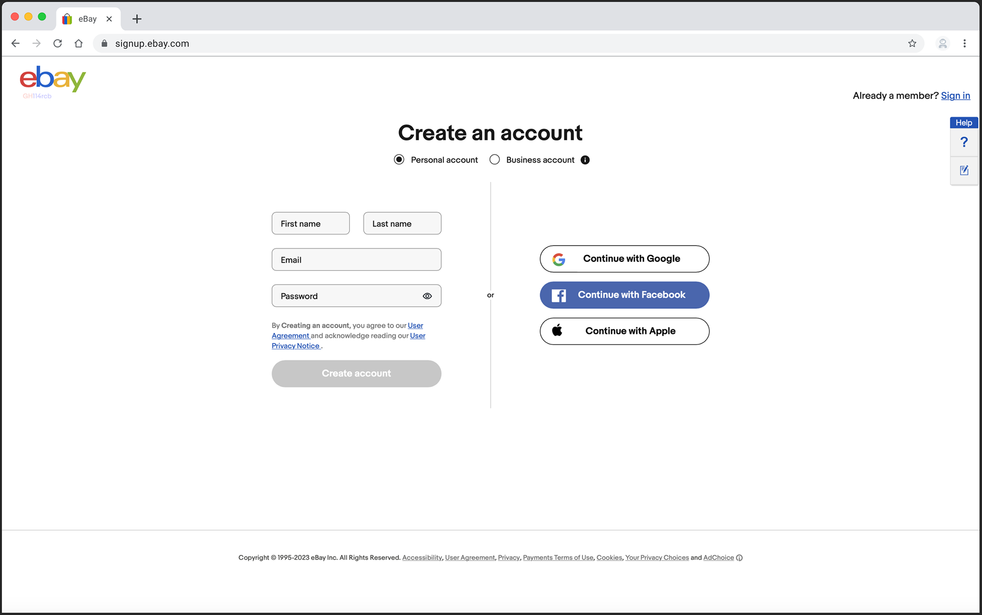
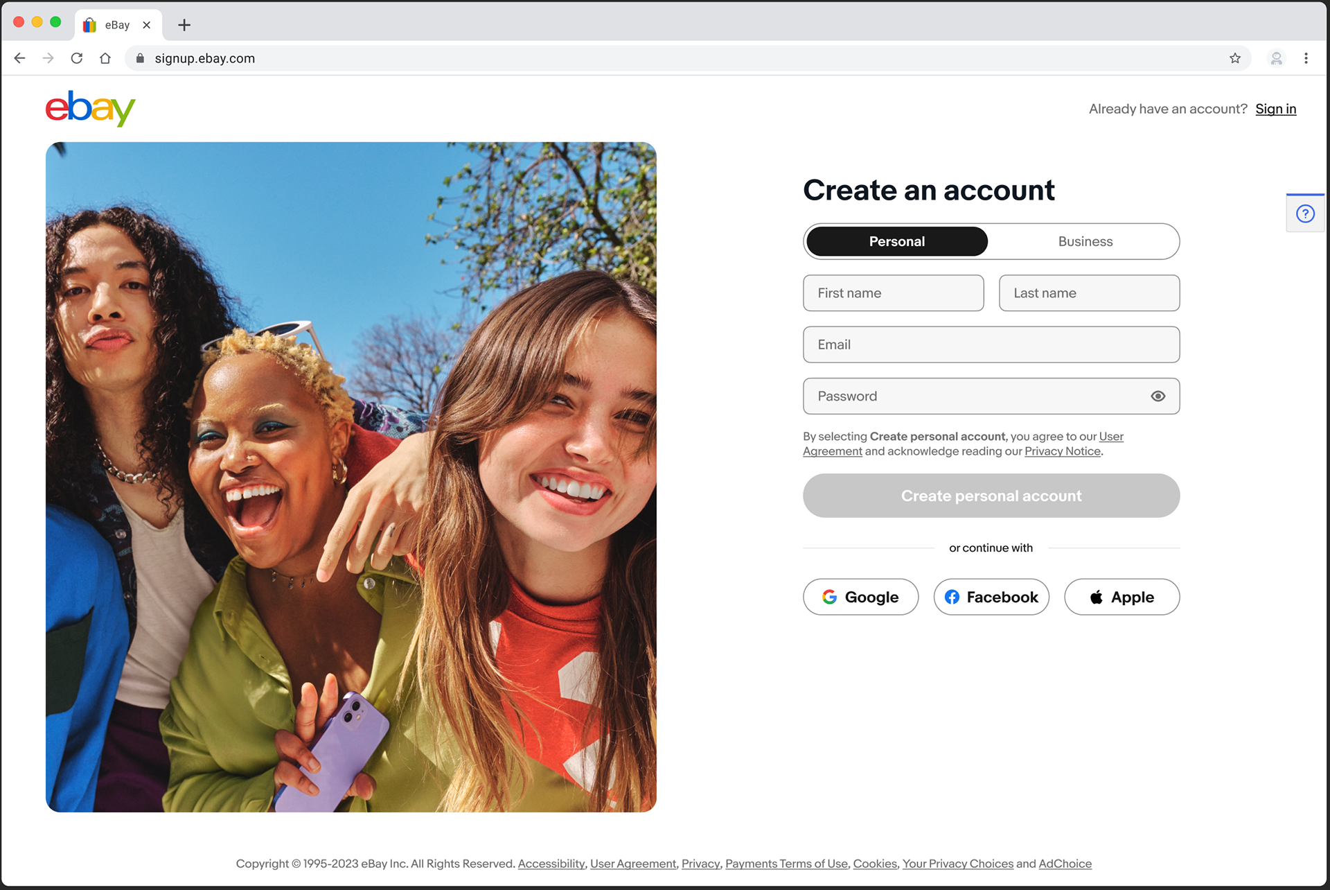
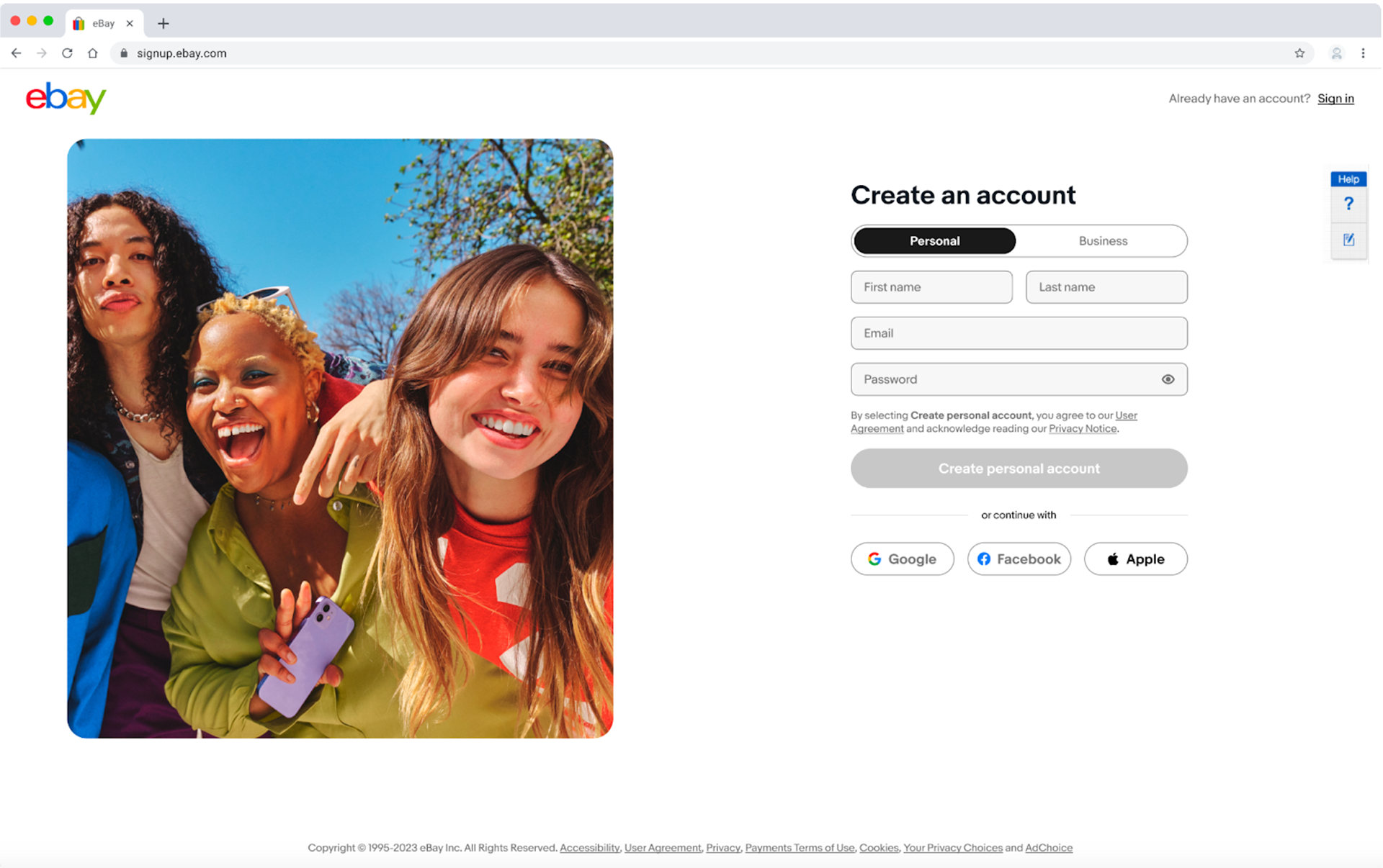
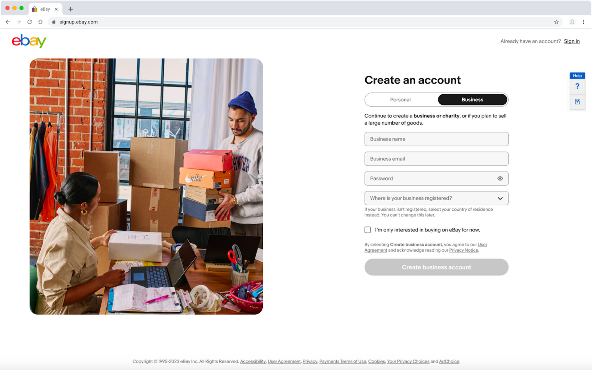
Radio buttons went unnoticed by many users, and we couldn't determine intent based on entry point.

Radio buttons went unnoticed by many users, and we couldn't determine intent based on entry point.
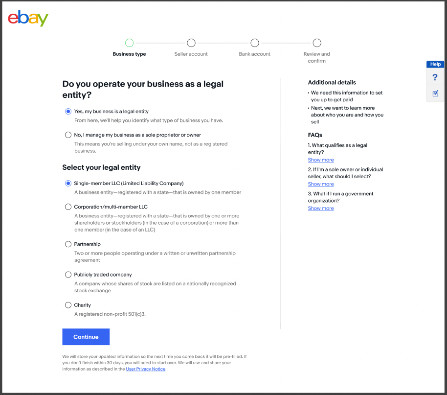
Account type page was overwhelming, causing users to make the wrong selection,
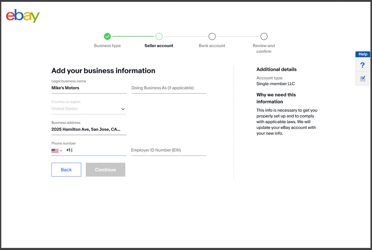
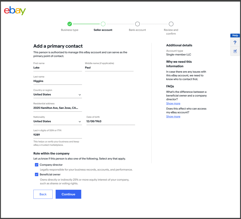
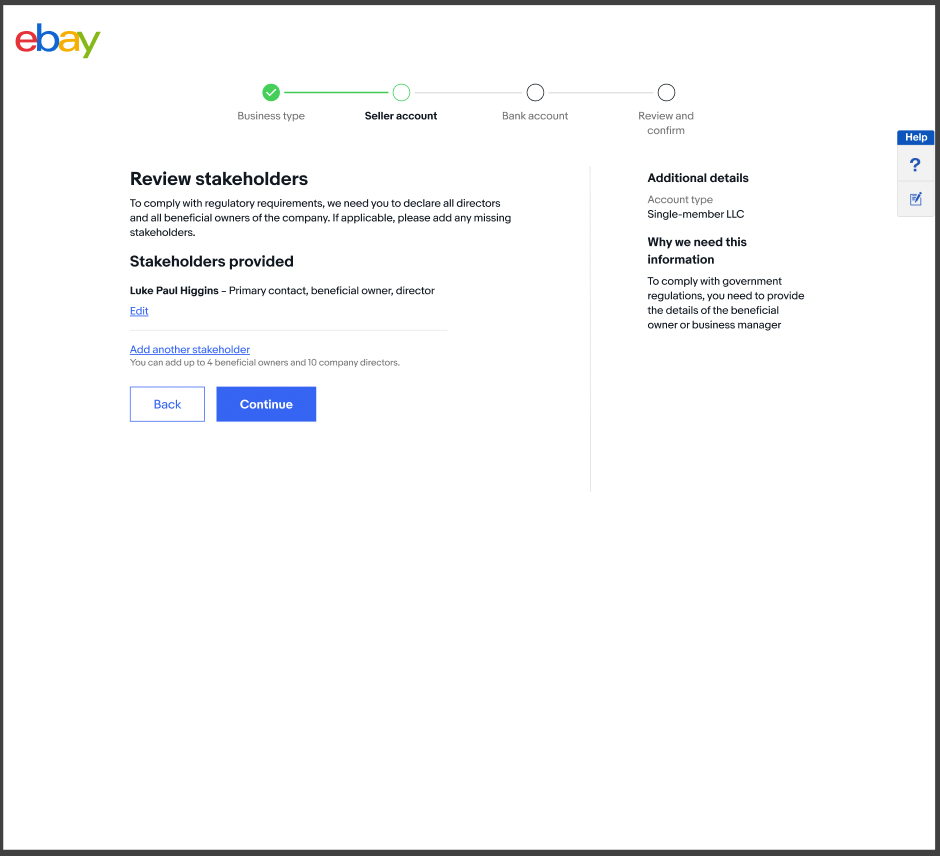
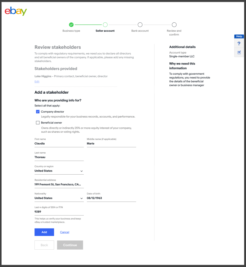
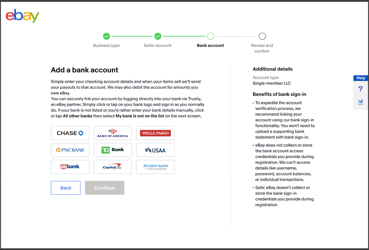
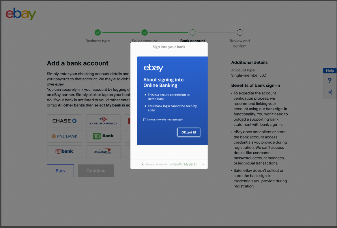
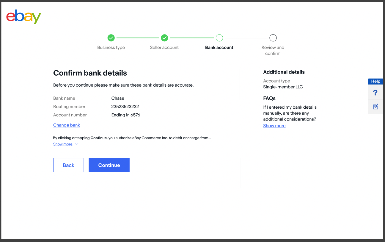
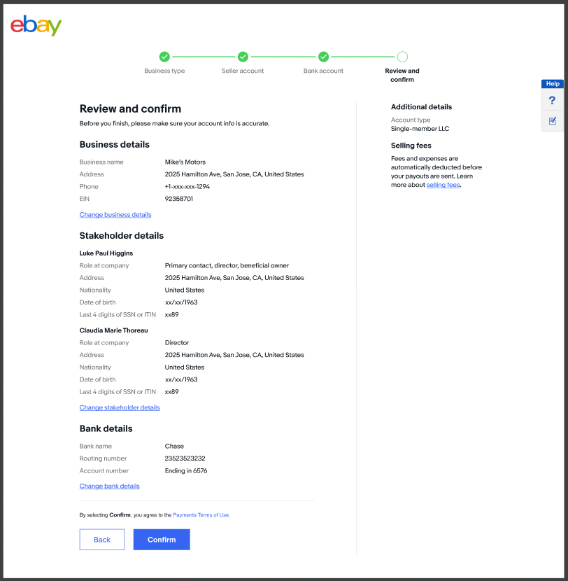
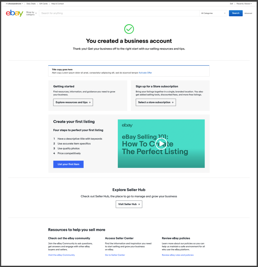
Phase 1 optimizations
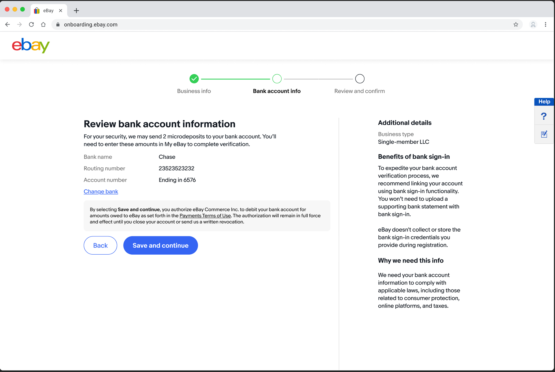
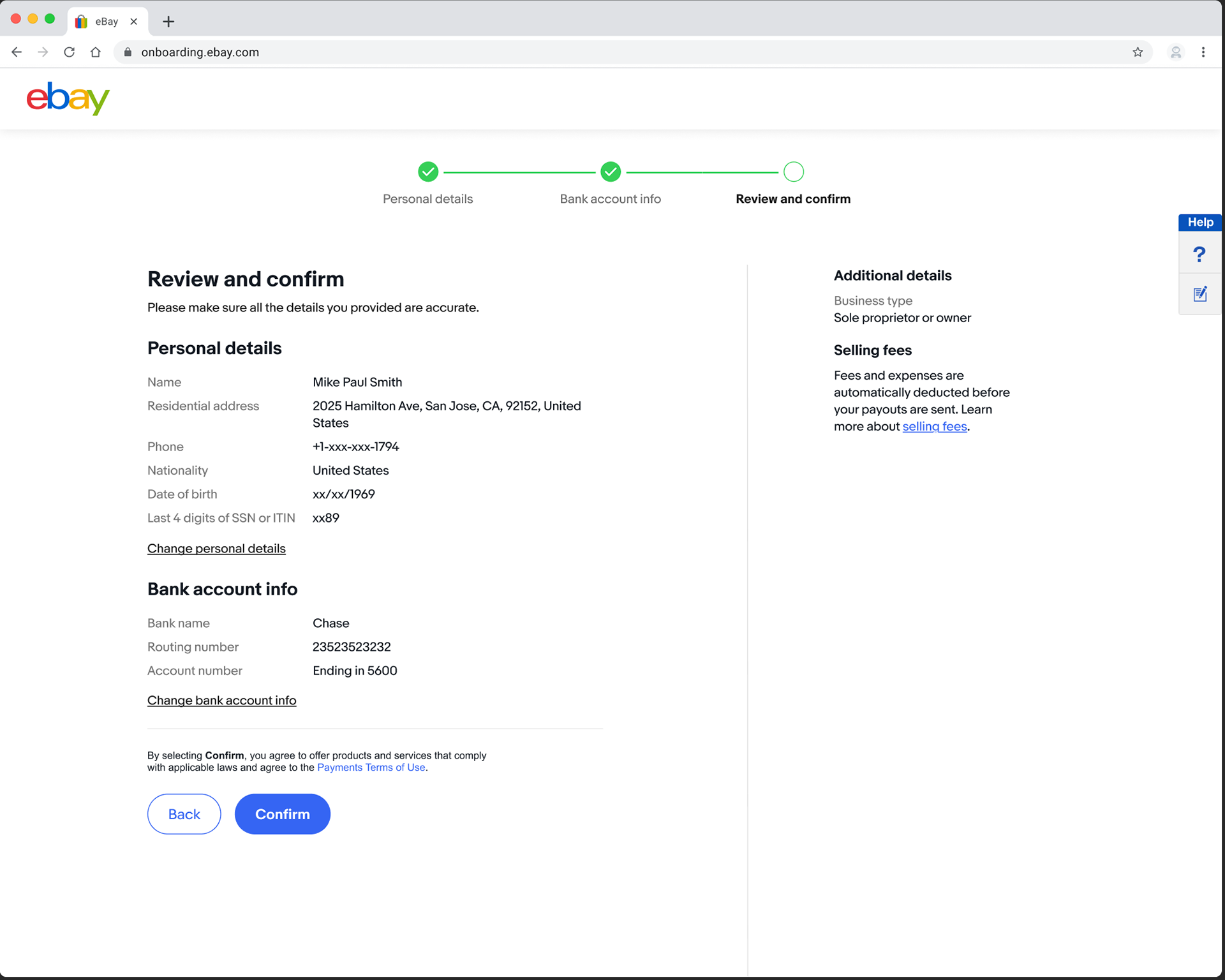
To reduce risk and gain quantitative insights, we took a phased approach. For Phase 1, we focused on quick optimizations that we hypothesized would drive immediate performance wins. These optimizations focused mainly on content changes, as well as some UI modifications that didn't materially impact the framework.
In particular, we focused on the following pages, where breakage was especially steep:
• Business details page (19% drop-off)
• Linking a bank (15% drop-off)
• Selecting business entity (6% drop-off)
In particular, we focused on the following pages, where breakage was especially steep:
• Business details page (19% drop-off)
• Linking a bank (15% drop-off)
• Selecting business entity (6% drop-off)
These changes also aligned with our UX Research, which suggested that poor context setting and education — as well as confusion about why we required certain data — were causing abandonment.
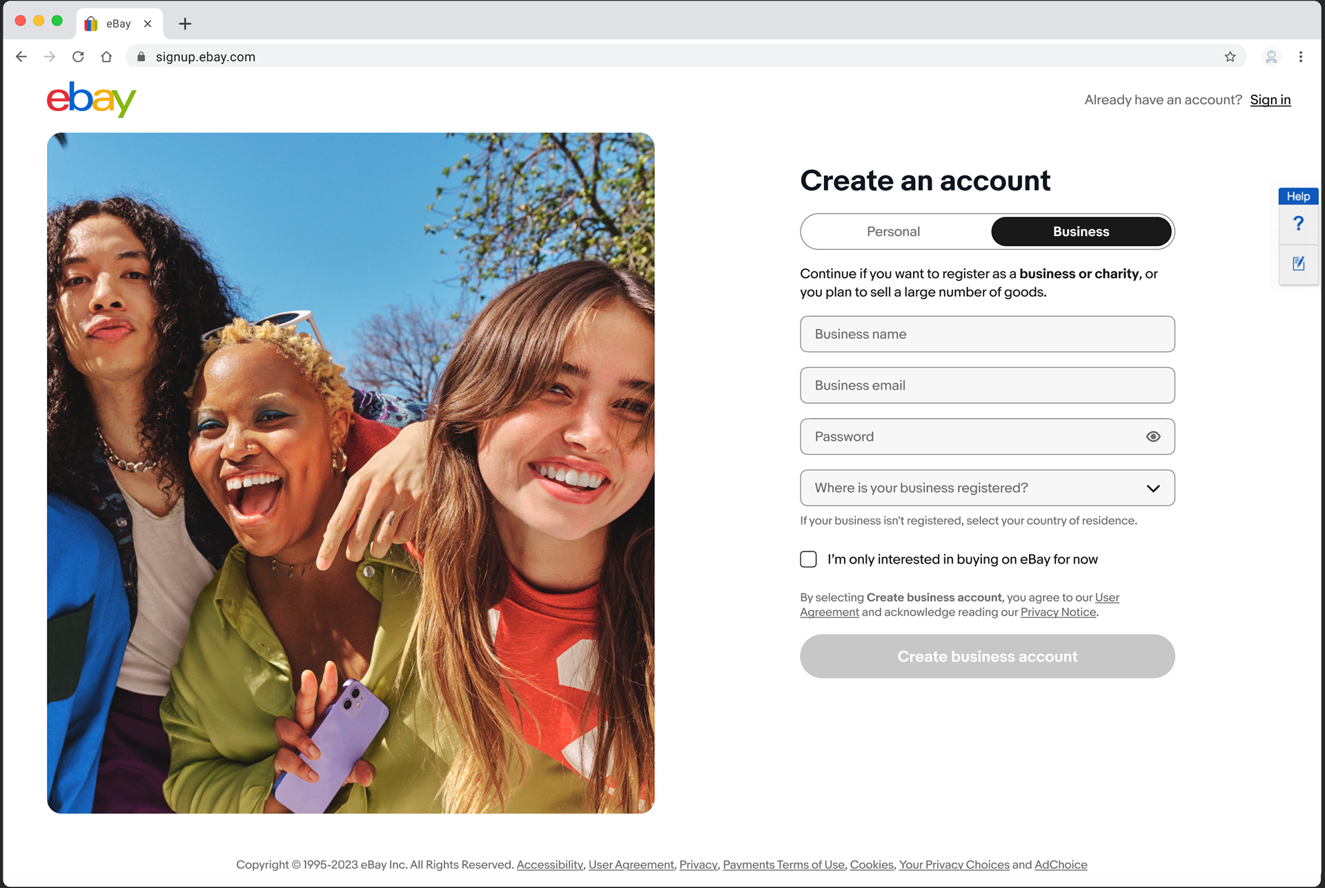
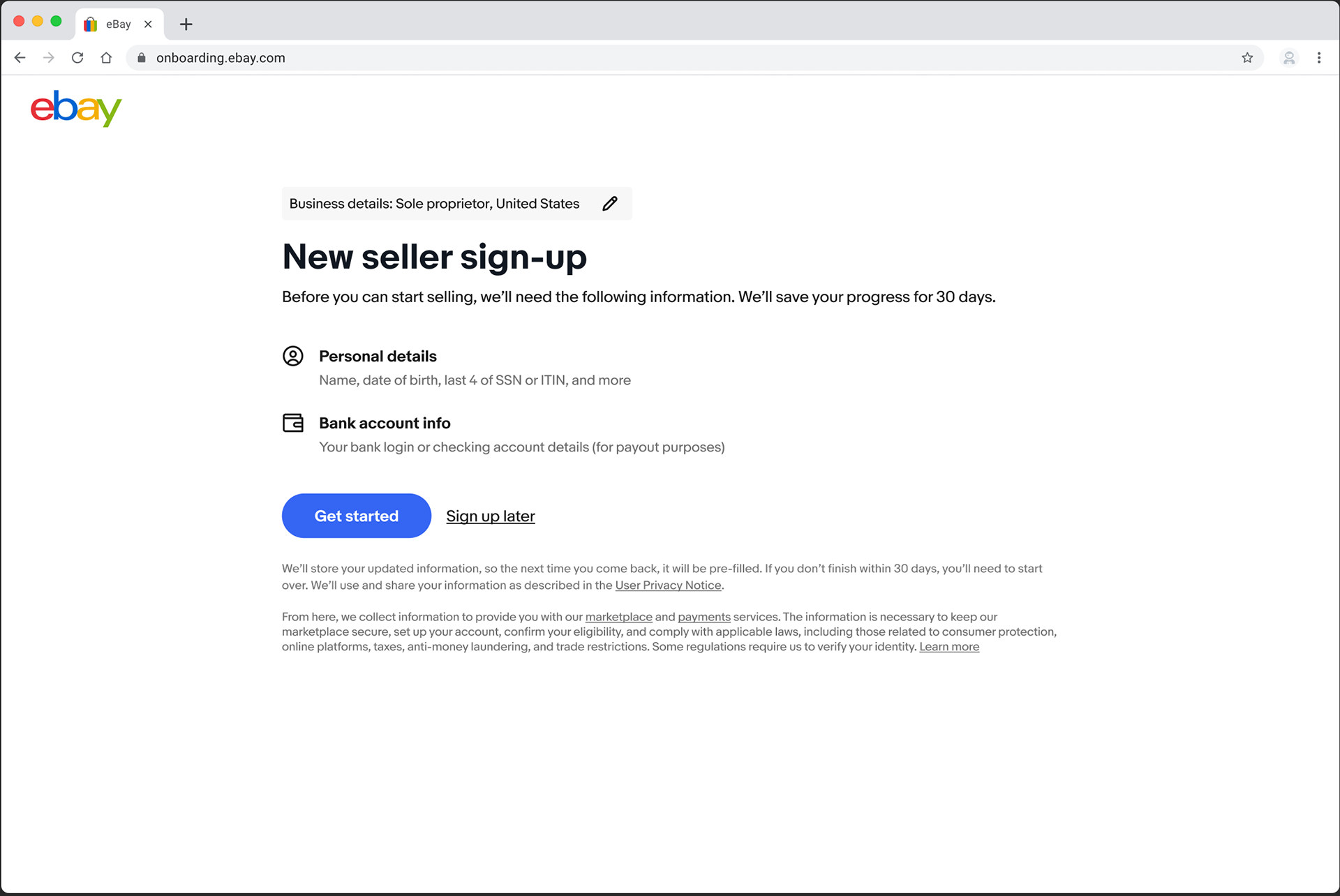
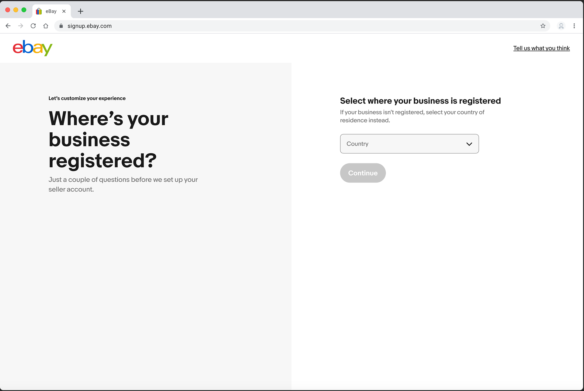
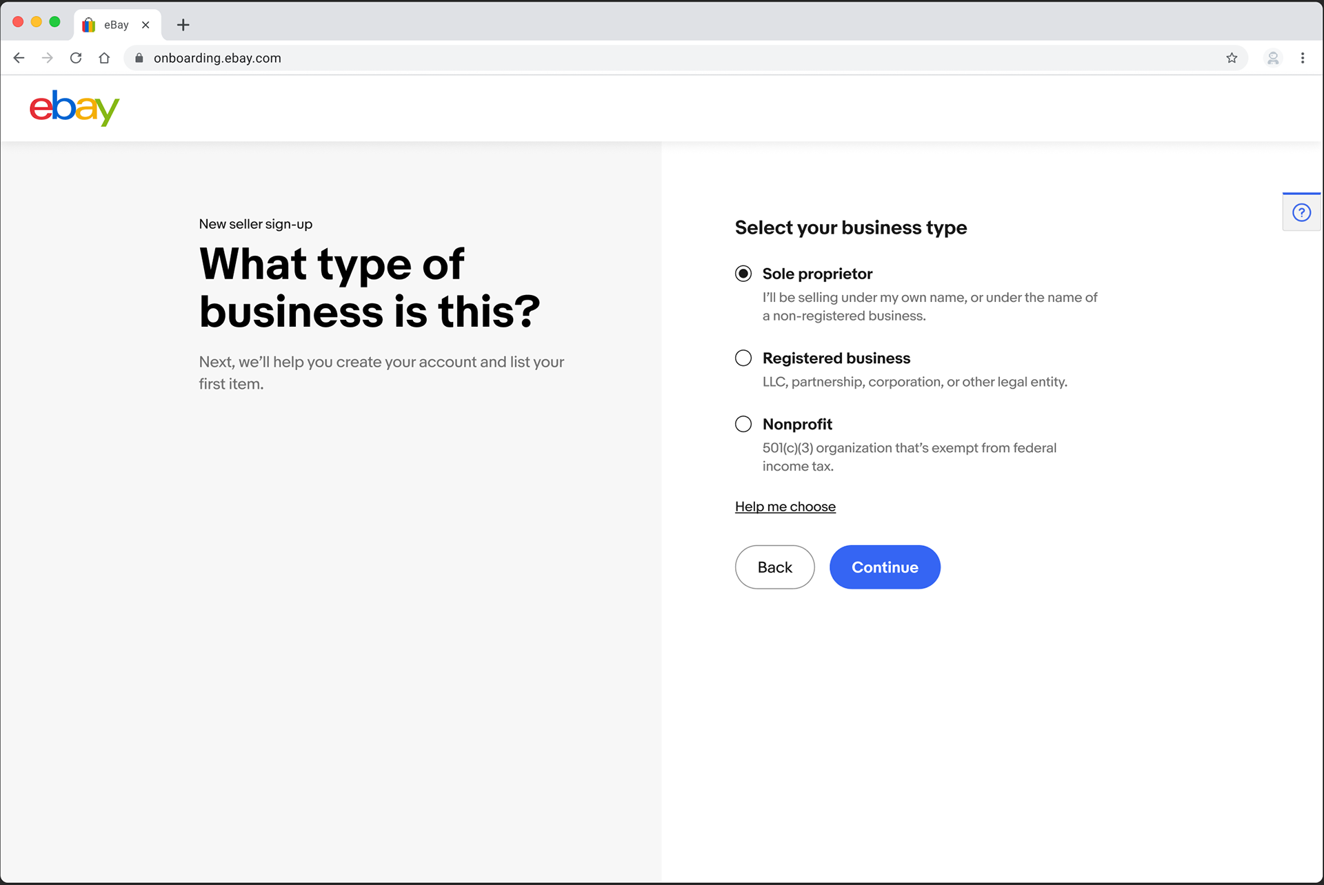
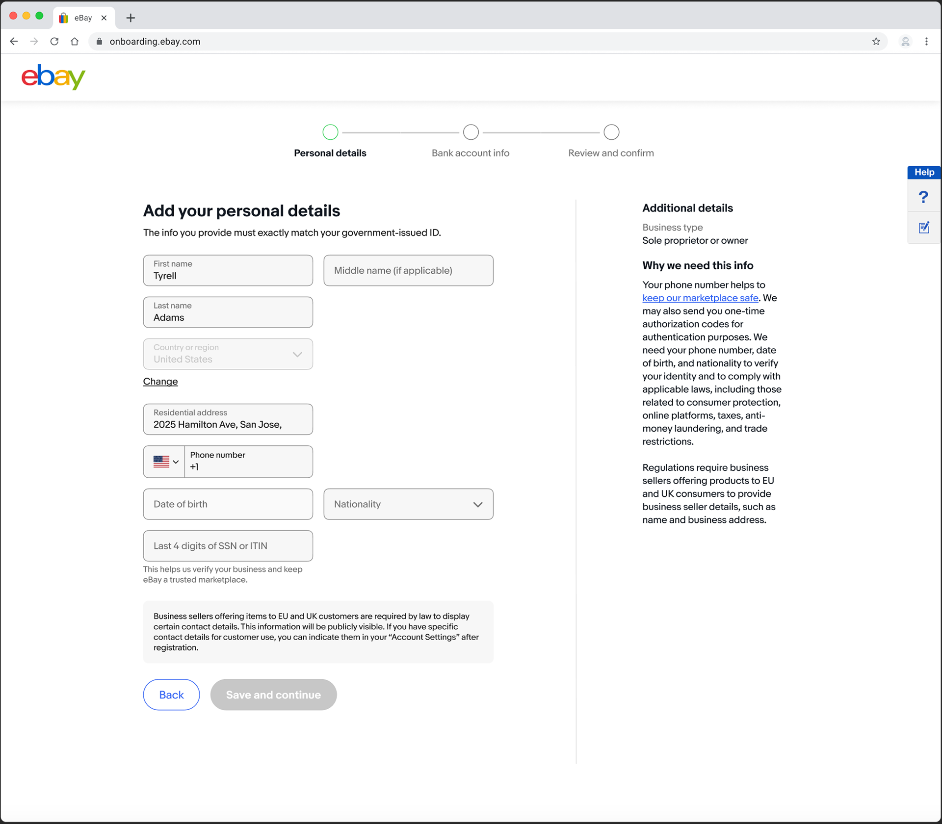
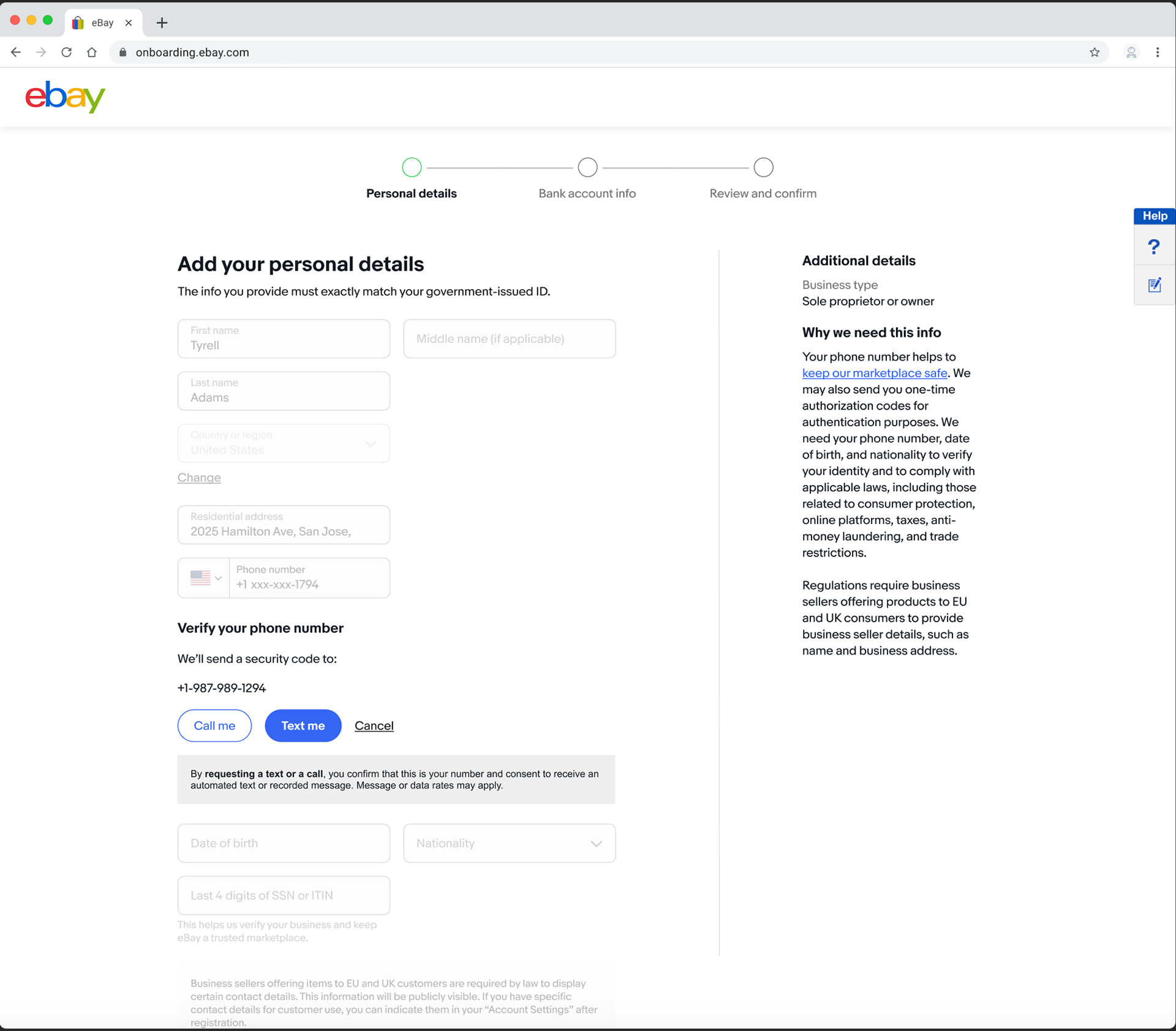
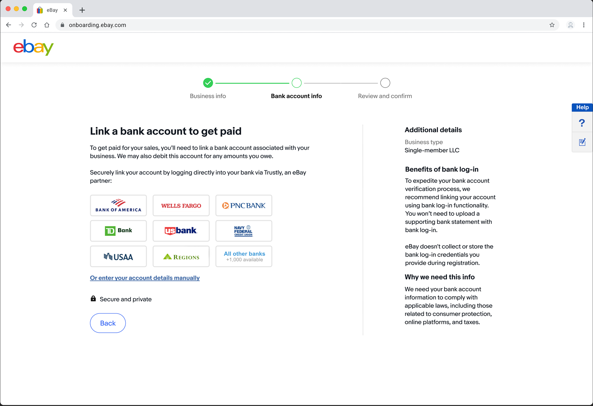
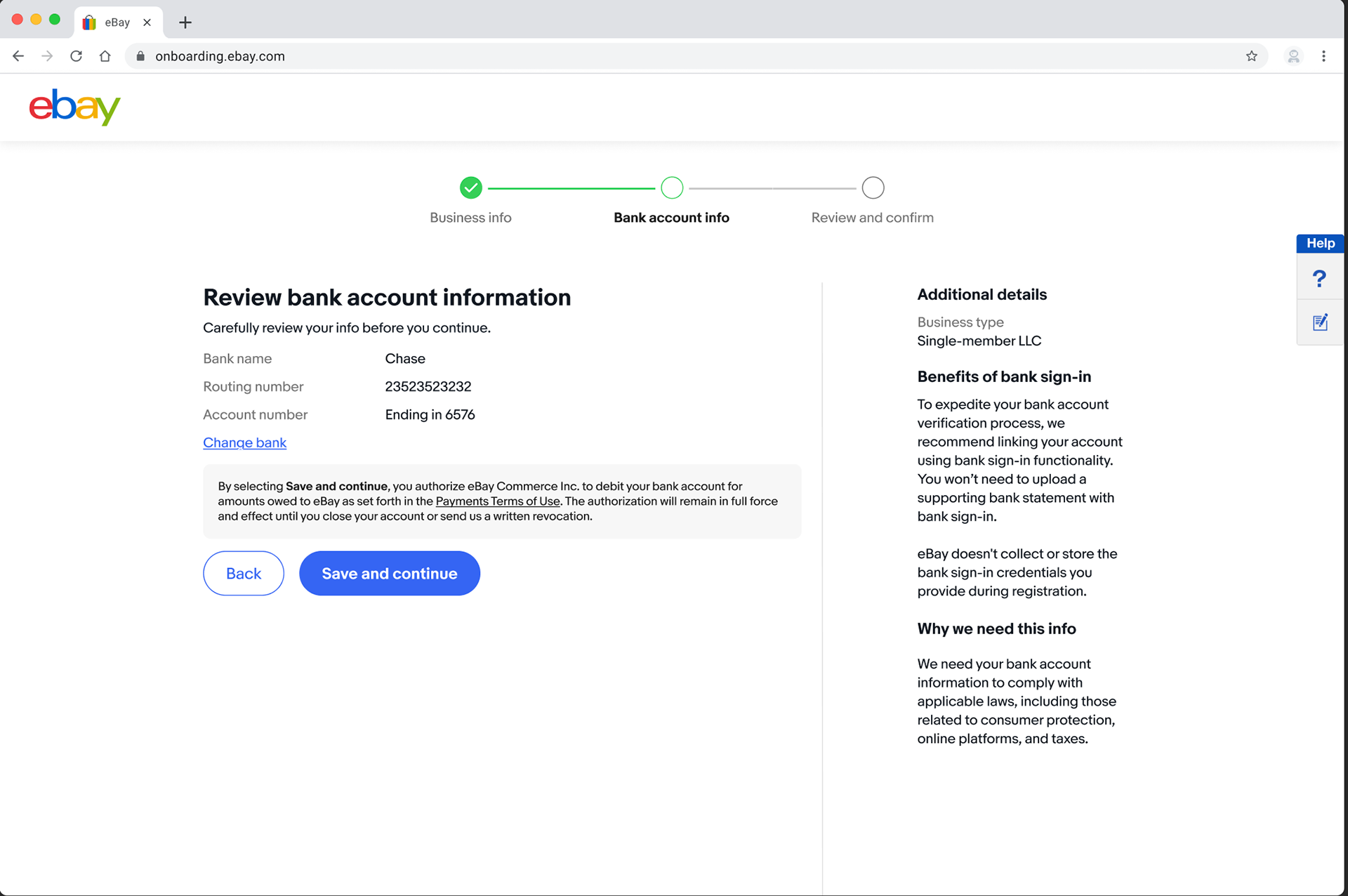
Phase 2 optimizations
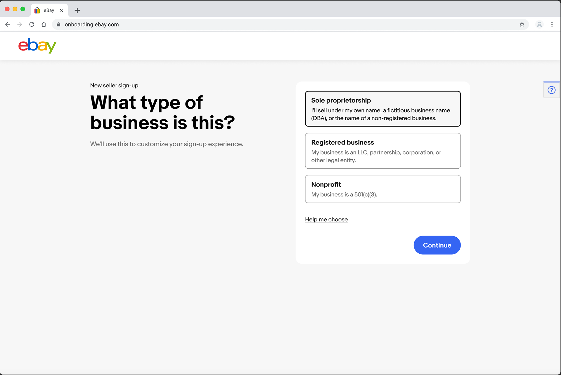
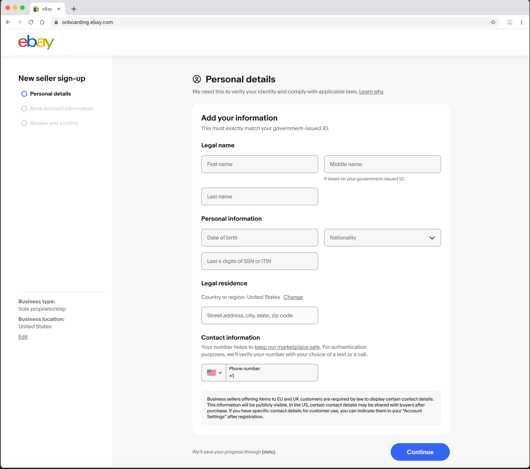
After completing our Phase 1 ramp, we quickly pivoted to Phase 2 of our redesign. We started our rollout with US, UK, and DE sellers, focusing on sole proprietors, who represent 63% of our business sellers. For this new phase, we introduced a brand-new framework and other key changes.
-We moved the context-setting screen after business-type selection.
-Revamped left rail allowing users to jump to different sections.
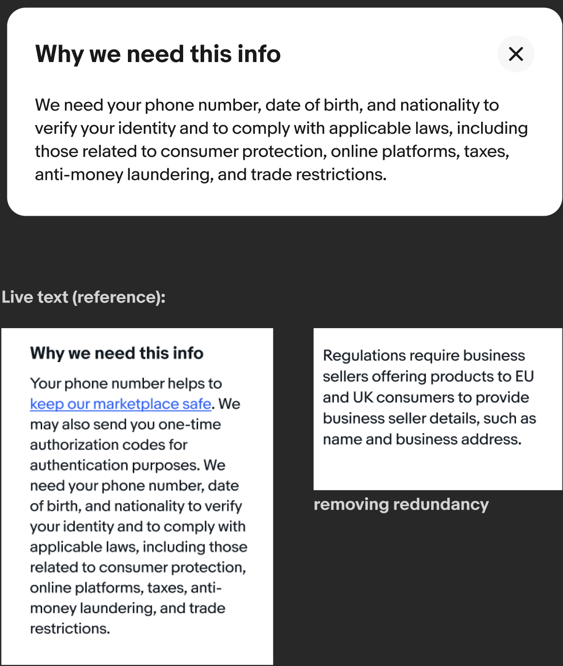
-Suppressed the right rail, moving legal and other supporting content in modals.
-We moved the context-setting screen after business-type selection.
-Revamped left rail allowing users to jump to different sections.
-Suppressed the right rail, moving legal and other supporting content in modals.

Rotating strings while the risk models run: 1) Completing your seller account; 2) You’re almost ready to list; 3) Just a little bit longer.
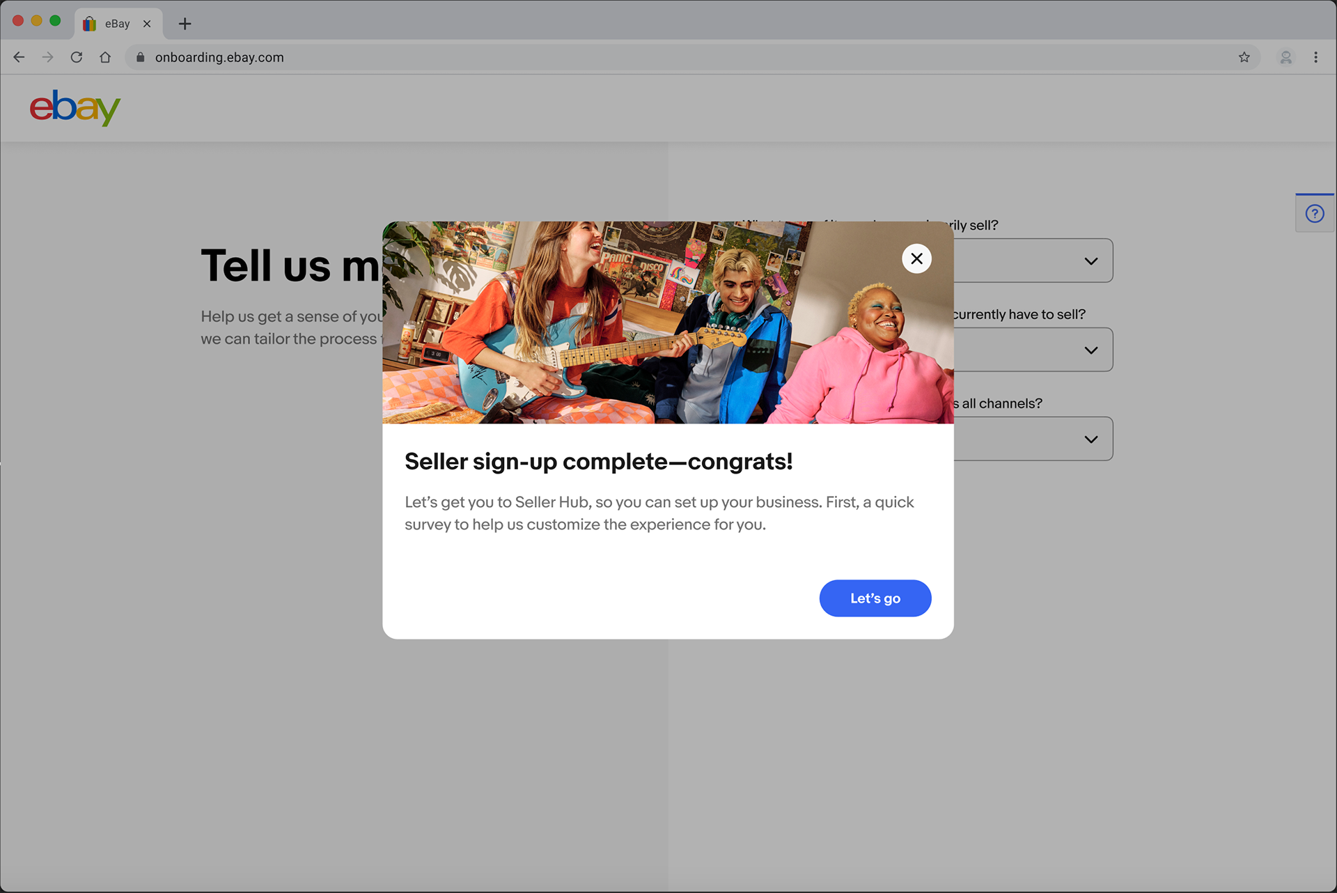
Before-and-after highlights
Account type landing page
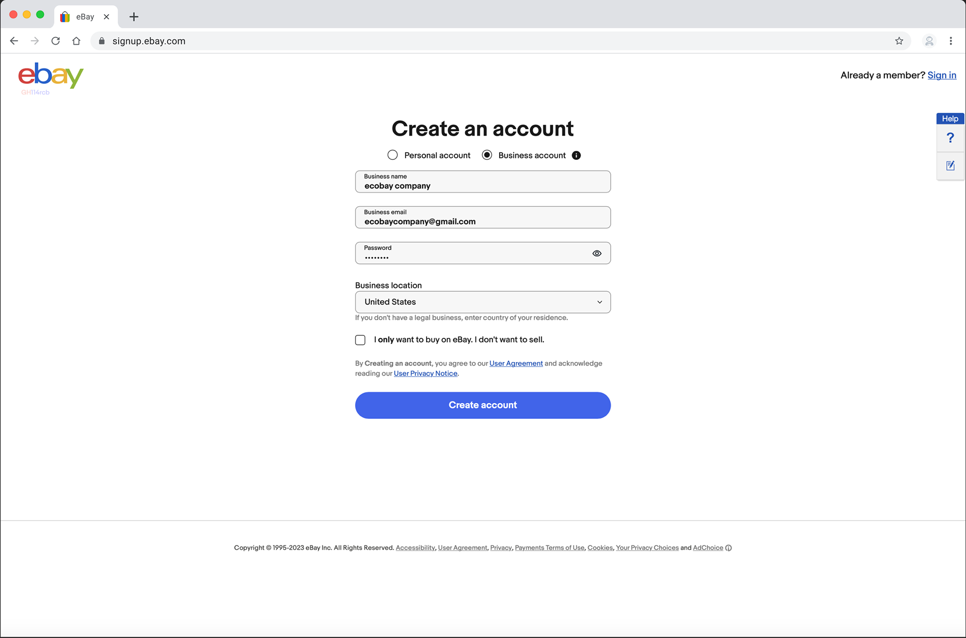
Before

After
Business selection

Before
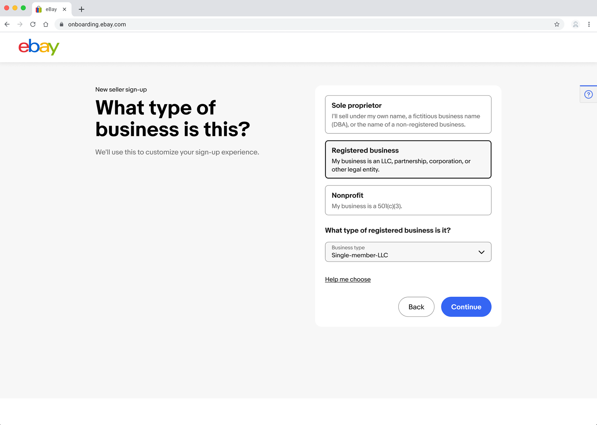
After
Context setting
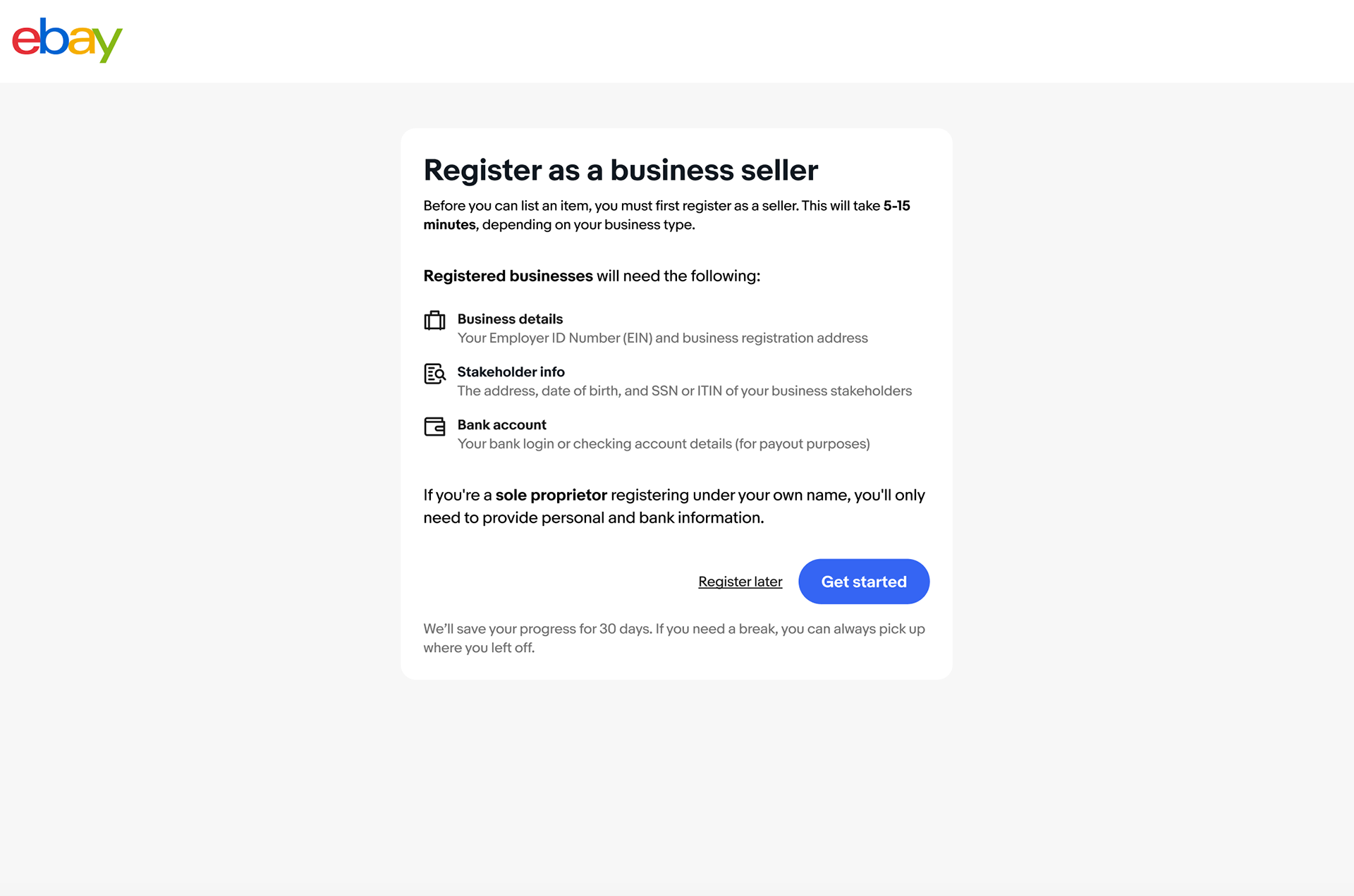
Before
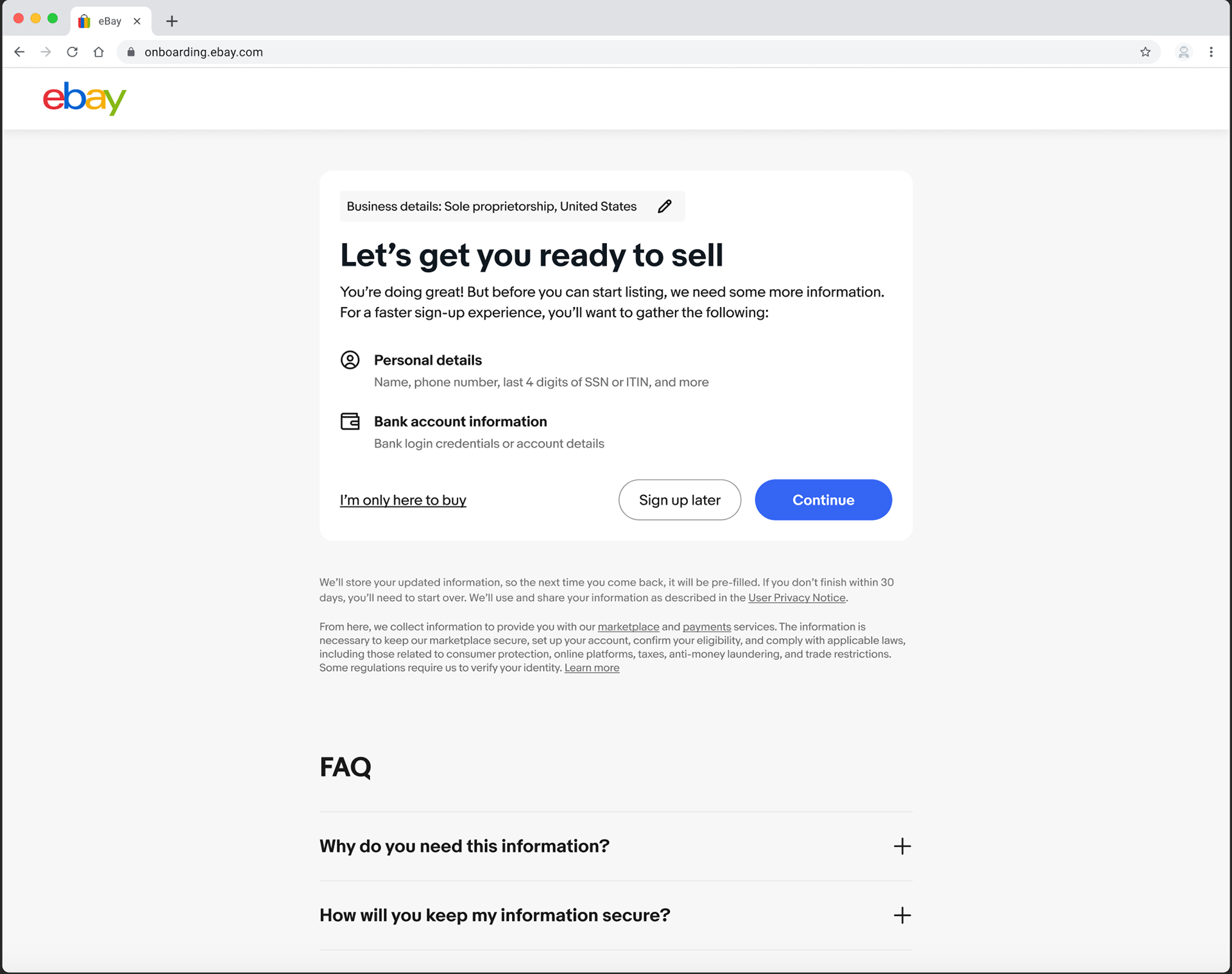
After
Primary contact
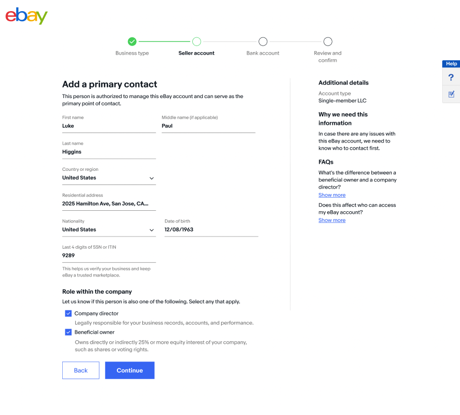

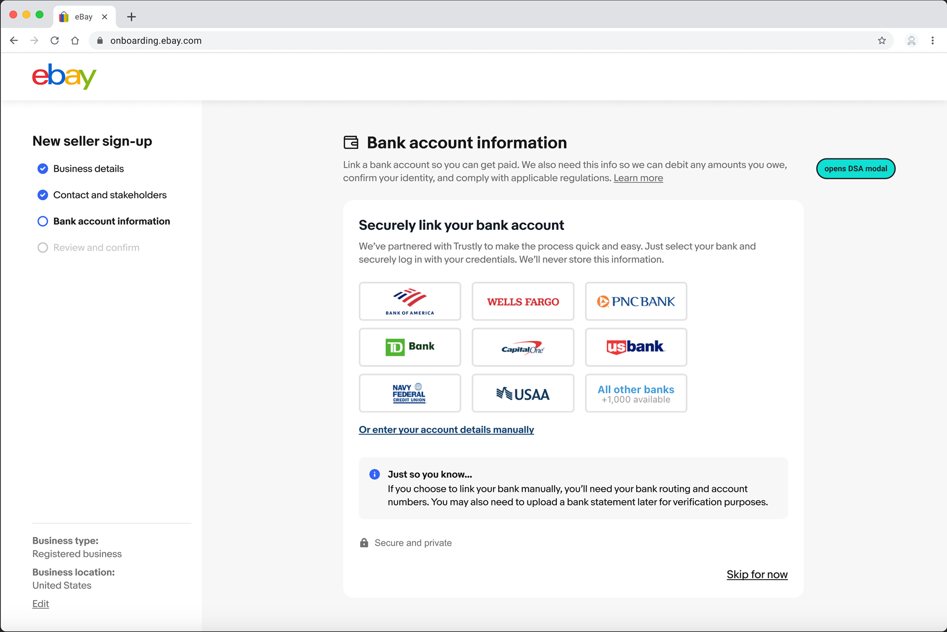
Bank account
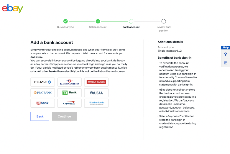
Before

After
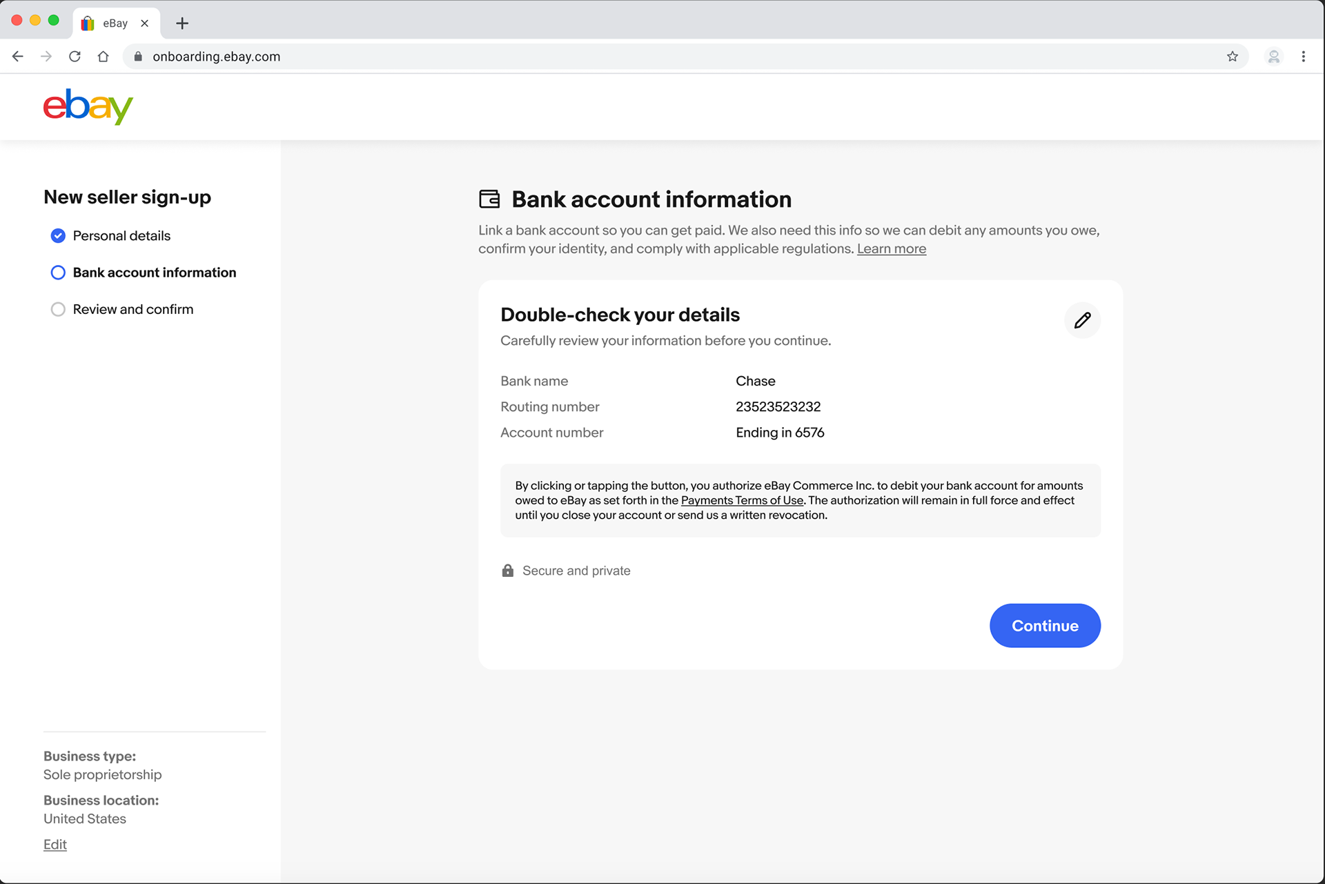
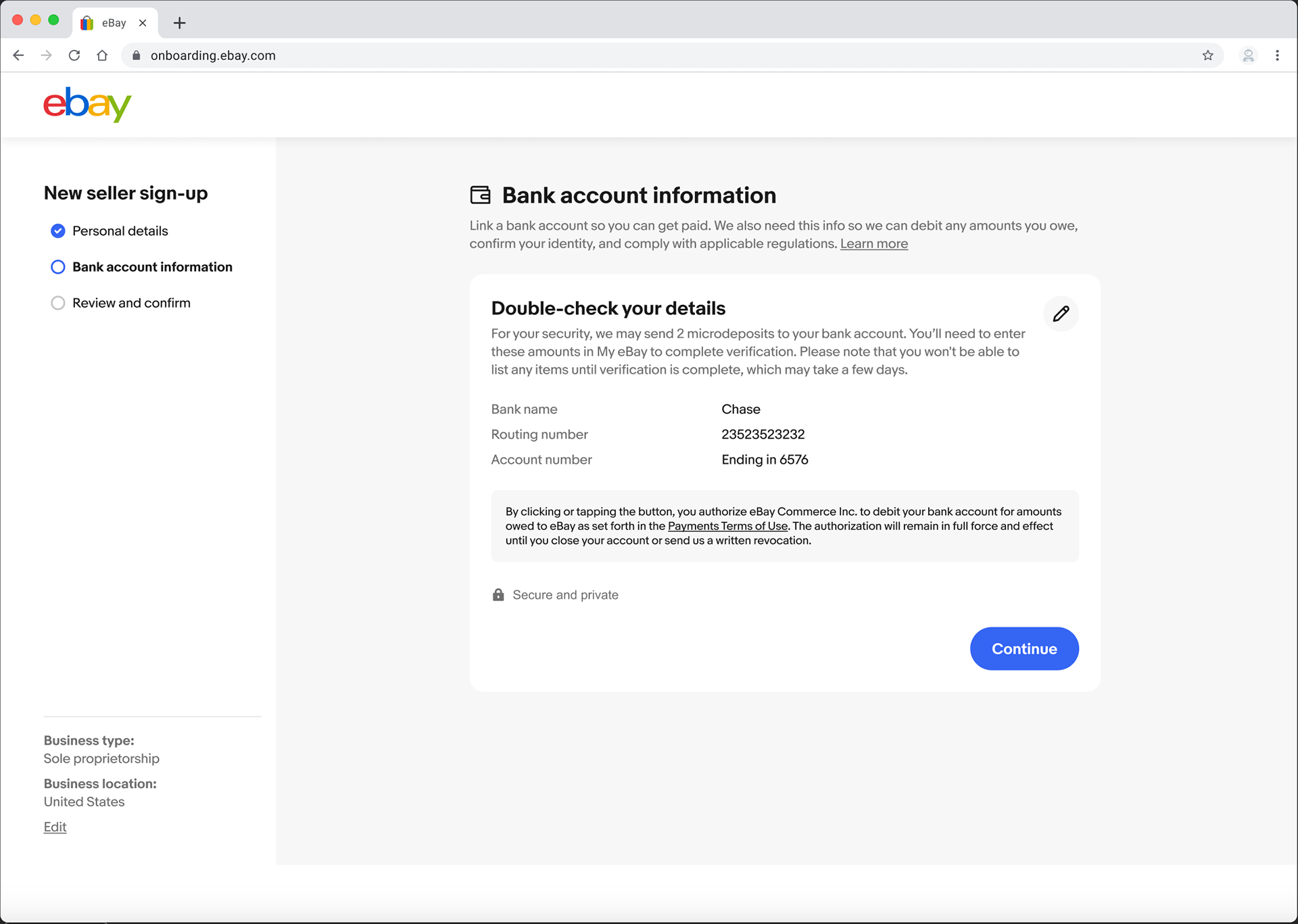
Confirm banking details
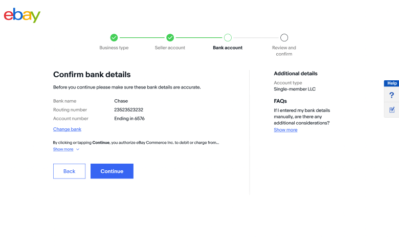
Before

After
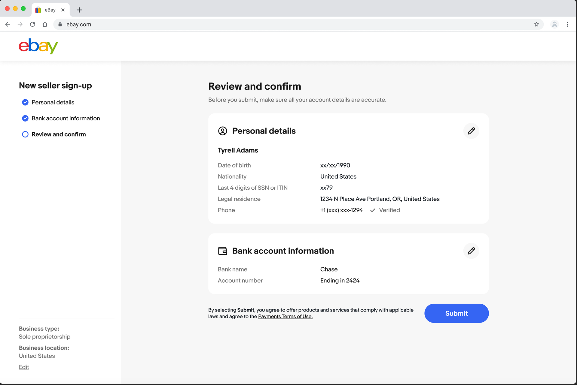
Review and confirm
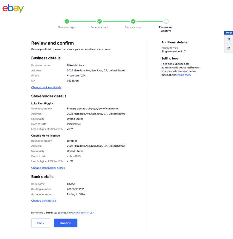
Before

After
Scalability and cocalization
In addition to the US, I created content variants for use across different countries. I worked with my design and legal partners to ensure the framework accounted for varying legal requirements across global markets and considered factors like text expansion. As an example, here's how the business type selectors varied across use cases.